Visualizing Small Datasets

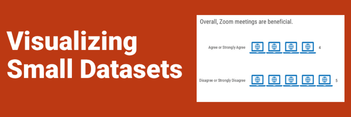
The morning that I’m writing this blog post, the US has just asked for a pause on the use of the Johnson & Johnson COVID vaccine because 6 women have experienced blood clots. That’s 6 cases out of the 6.8 million J & J vaccines administered, or 0.0000882%. This is…

Read More

Alternatives to a Log Scale

Over in our private Academy Slack group, one of our members asked a solid, totally not snarky question about log scales. They’ve been common in visuals about COVID and there’s a fair question out there about how appropriate those are in graphs aimed at public consumption.

Read More

Title Charts Like A Journalist

When you spend the bulk of young adulthood in research-focused academic institutions, like I did, you are steeped in a culture that tells you, explicitly or implicitly, that you can’t ever really make a claim. Taking a position on something can be seen as biased. Claiming an insight can be…

Read More

My Cringe-Worthy Choices

The theme of this blog post can be summed up with one emoji: >.< If you aren’t emoji-fluent, that’s the facepalm, a gesture made when you are internally dying of embarrassment over someone’s incompetence. In this case, that someone is me. I have failed to recognize when I was using…

Read More

Make Great Graphs in Google Sheets

If you’ve ever been in the audience of one of my workshops, you can tell that I was once a teacher. I use the same classroom management skills when I teach 100 adults how to graph as I did when I was teaching 25 kindergartners how to read. Back…

Read More

2021 Evergreen Mentoring Program

Life and death situations cause us to rethink our priorities and the pandemic has been no exception. I have seen so many of you come to the conclusion that you want more control over your day-to-day experiences and you are ready to take that tiny side hustle and turn it…

Read More

Proportion Plots

Proportion plots help us compare the share of a population between two metrics. It uses length on the left and right side of the chart and connects the lengths by a band in the middle that swoops a lot if there is disproportionality and stays pretty even if the proportions…

Read More

Decolonizing Data Viz

What is Data Visualization? A visual representation ofquantitative or qualitative data. so says Stephanie Evergreen. The strength of this definition is that it is so broad, lots of things fit under its umbrella. But perhaps that is also its weakness because it leaves what counts as data open to interpretation…

Read More