Tameeka emailed me this: “I’ve been a researcher for 10+ years but my passion and strength really is data viz. I’m trying to figure out how/where I can do that more than other research stuff. Should I start my own data viz business? Any chance you’d be down for like…
Author: Stephanie Evergreen
When You Shouldn’t Hire a Data Viz Consultant
Hiring consultants to conduct studies can be an excellent means of turning problems into gold, your problems into their gold.– Martin Marietta Cheeky, Martin. But there’s some truth to that – consultants are expensive. In 99.98% of my consulting projects, my clients get so much value that…
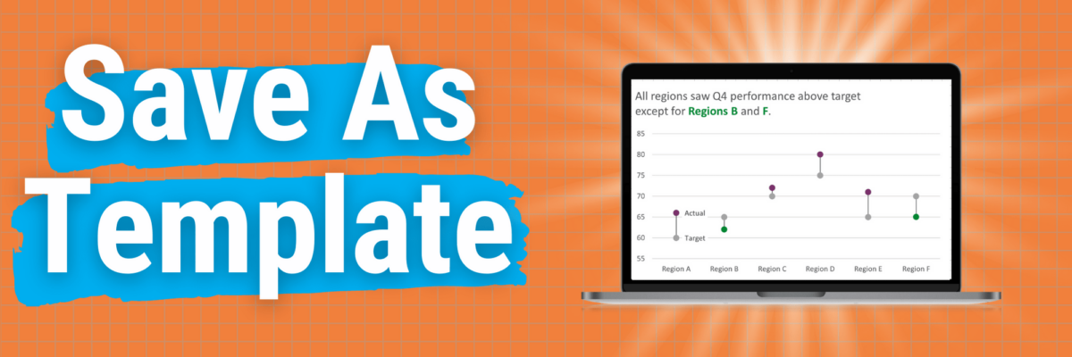
Save as Template
This is my A+ #1 100% best time-saving hack for making graphs in Excel. When you go through the process of making that one graph that’s totally perfect, you can save it as a template so it becomes, essentially, your new default graph. Here’s how. Right-click somewhere in…
Signs Your Data Viz Sings
I wish that every awesome data viz presentation ended with each coworker blasting a confetti popper over your head. The reality is that when your data viz sucks, you know it loud and clear. When it sings, you often can’t tell. This post is not going to provide an anatomy…
Signs Your Data Viz Sucks
You might have landed here because you thought this was going to be a post full of snarky commentary on mediocre graphs. It isn’t. In fact, I’m not going to include a single data viz. Because what makes a data viz suck or sing isn’t just about its outward…
Announcing: The Evergreen Empire
I was vacationing lake-side with my family, awake at 3am with an idea for a brand new business. I just couldn’t shake it and get back to sleep. I found a stack of rainbow colored post it notes in the kitchen drawer of the Airbnb and by the time…
Introducing the Power BI Chart Starter Series
Everyone wants a dashboard. But making a GOOD dashboard can be as hard as snagging a selfie with Beyonce. The friction I see most often is because the dashboard software is confusing to use. It’ll get you feeling like you’re groping around in the dark for the light switch.
Data Viz Audiences
When people aren’t 100% sure you are talking to them, they ignore you. (Heck, when I’m jogging and the dude in the car is clearly talking to me, I still ignore him.) You want your audience to immediately see themselves in your data and how that data story is relevant…
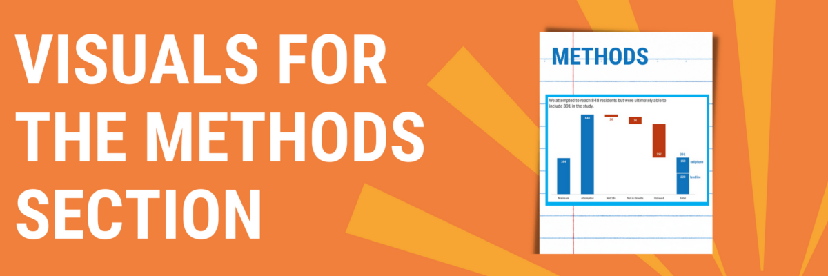
Visuals for the Methods Section
You can tell when someone is getting their data viz eye well-honed because they start asking where ELSE can I include visuals that will better explain my work? That’s Sue. She had grown comfortable with high-impact, story-telling charts in the Results section of her reporting but…
Add Labels ON Your Bars
Meg, an Academy student, sent me a great question for our monthly Office Hours call: How do I replicate this? Pretty cool chart, right? It comes from Global Web Index, who put out tons of relevant data in interesting graphs.
