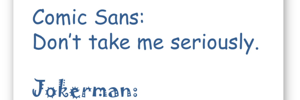
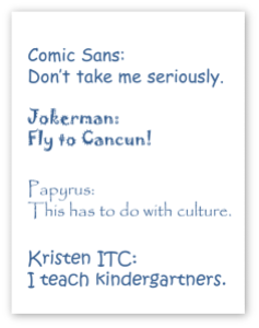
Two years ago I ran this tiny contest on my social networking platforms for the worst font ever. Far and away, Comic Sans was the winner. Here are the others that deserved mention, along with the messages they tend to communicate:
Jokerman: Also says “Fajitas Tonite!” (spelled with “nite” instead of “night,” for sure)
Papyrus: Also says “yoga studio” or “Egypt”
Okay, I’m joking. Kinda.
But with these examples we can see how our font choices communicate for us, outside of the actual words we type with these fonts. Still, these examples are pretty easy targets. And they are two years old!
So dig a little deeper and type your new nominee for Worst Font Ever into the comments below. Winner gets a high-five.
PS. Font nerds unite!


