Updated Note from Stephanie: This blog post generated a lot of discussion. Some of that is in the comments here, some of that has been deleted, some of it came from Twitter and via my inbox. Be sure to read the comments to get a sense of the critique. At the bottom of this post, before the comments, I’ve provided some of my reasoning because I think context helps and to explain why I’ve had to delete comments (Hint: Threats!)
Note from Stephanie: I outlined a few ways to show regression data in my latest book but they all avoid the regression table itself. This guest post from William Faulkner, João Martinho, and Heather Muntzer illustrates how to improve the simple table and how to take that data even further into something that doesn’t require a PhD to interpret.
The world is going to hell in a handbag, and it’s because data viz people haven’t stepped up to the plate.
There’s a dark horse of data viz hidden in plain sight, which has for decades made a mess of one of humanity’s most crucial quantitative tools. This villain is the regression table.
The world runs on regressions.
How many times have you heard “studies show that [blah],” or “it turns out [blah] leads to [blah]”? More often than not, these ‘facts’ are (over)simplified interpretations of a regression. Regressions are THE most common statistical way to determine whether there’s a relationship between two things – like doing yoga and wearing tight pants, or, as we’ll see in a sec, a person’s race and likelihood of being shot by the police.
People interpret the results of regressions using regression tables (and little else)
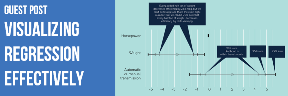
A ton of super important decisions get made on the basis of simple statements like “studies show you can reduce [blah] by [blah]%.” And these invariably come from a regression table, which usually looks something like this example analysis of 1974 cars, testing whether those with automatic or manual transmissions are more efficient:

(R user? DIY kit available here)
Regression tables are TERRIBLE visualization tools. The WORST.
Nobody wants to look at that thing! Are you kidding? And worse, even if you’re a quantitative genius really interested in the results, it’s STILL hard to intuit what’s going on.
For The Love Of Humanity, Let’s Fix This.
WARNING: This middle section is for the nerds. If you don’t run regressions yourself, feel free to skip down to Section III
The Tame Tweaks
Even without going wild, we can just stop being so careless. With just a few simple tweaks, we can go from this:

To this:

We’re not claiming perfection, but at least we’re not being as cruel to our audience. Seems a lot easier now to see that the automatic-manual distinction is not as important for efficiency when we account for weight and horsepower.
Let’s Go Nuts
Think outside the box (ahem, table), when it comes to regressions, maybe we can just graph the coefficients?
How changing the horsepower, weight, and transmission type of the average 1974 car seems to affect its mileage:

Again, not perfect. But it’s a start towards diagrams that intuitively show what we really care about in most cases:
- Size of coefficients
- Uncertainty of coefficients (confidence intervals and/or statistical significance)
- Explanatory power of the model overall
And that’s it!
Because It Is Important.
Last year, Harvard professor Dr. Fryer released a working paper inspiring some controversial headlines.

Did the paper really claim that blacks were 23% less likely than whites to be shot during an encounter with police? The whole hullabaloo boils down to – you guessed it – a regression table which is, as per usual, practically indecipherable:

Let’s try our tweaks from before:

Add a possible title, like:
As we factor in other variables, such as whether the suspect had a weapon, whether the bias is towards blacks or whites becomes a lot less clear and we can’t be nearly as precise about the amount of bias.

That’s better. Not perfect, but better. Turns out as we consider more and more aspects of the encounter, that strong bias towards police shooting white suspects gets a lot more muddled.
And It’s Not Even That Hard.
But you’re right. Who cares about nuance? In a world which constantly steamrolls detail in the name of thumbs-up or thumbs-down now-and-forever conclusions, who’s got time to worry about subtleties?
We’d like to think some people do. We’d like to think oh-so-many-more would take interest were it not for these bristling anathemas – regression tables. Regression analysis and data viz experts, let’s give folks a chance:
- Be nice to your audience. If you put a regular, white, asterix-splattered regression table in front of them, that’s inconsiderate. So don’t. Instead,
- Use accessible labels, translate jargon
- Take out extra decimals
- Use color, shading, and transparency to express the key info in multiple ways.
- Consider what’s important about the analysis – this means both the finding itself and the degree of uncertainty surrounding it! Tools like heatmaps and the coefficient charts above help to put all that detail out there in a quickly digestible format.
Big problem. Reeeeeasonably easy solutions. Now the fate of the world is up to you. No pressure.
Authors:
William Faulkner – Director, Flux RME
João Martinho – Evaluation Specialist, C&A Foundation
Heather Muntzer – Independent Designer
PS: We asked for data from the Harvard team to replicate this study and produce even better visualizations. Despite a few kind replies, they never got around to sharing it.
PPS: More materials from this project are available in this Google Drive folder.
PPPS: Questions? Email William.
Updated Editor’s Note:
I’m updating my editor’s note on this post because of how laughably out of hand things have gotten. Statisticians are really unnerved by some of the wording used in this guest post. It’s ok to disagree. I welcome those discussions and comments because they help everyone keep evolving their thinking.
But I’m heavily screening all comments posted to this thread from this point forward because now I’m getting threats like this one:
If you do not bring that uninformative guest post down, or fix it, I will bring this to the attention of the media and my fellow colleagues at ASA. Trust me, you do not want that kind of attention.
Um what? Report me to the American Statistical Association? LOL
More than one person took issue not with the content of the blog itself, but with the way that I asked the critics to improve upon what they didn’t like. One person wrote:
I am profoundly upset with your and Faulkner’s reaction to the comments.
Rule #1, as I’ve stated before, is that this is my blog. I’ll say what I want. I’ll outright and without apology delete any comments that attempt to tell me how to handle commenters or whether to pull a post. If you feel so strongly that it is bad, don’t read it. Start your own blog.
That doesn’t mean I defend errors. It means that I’m ok with mistakes – I’ve made plenty of my own – especially when they foster good discussion. But good discussion means generation of new ideas. Only one statistician in all of this mix has agreed to make a better attempt – in a few weeks.
Yes, of course, I’m asking critics to do better. Being an armchair critic is easy. To paraphrase Brene Brown, if you aren’t in the arena with me – actively trying to make things better by putting forth efforts that could be wrong or critiqued – I’m not interested in your opinion.
Several commenters questioned my intelligence. And then one guy (they were almost all white guys) said:
People are just trying to help you.
LOL you dudes are so funny. Insulting my intelligence is not help.
It might help, actually, to understand a bit more about me and the guest post authors. I have a PhD in interdisciplinary research and evaluation. I met the guest authors at an evaluation conference. (Did you see that the lead author’s name is William Faulkner?? How can you NOT have tequila with this guy?) If you don’t know what evaluation is, it’ll be good for me to explain it to you because there’s a pretty big difference between conducting pure statistics and evaluation.
Evaluators are like researchers in that we seek to generate knowledge but we conduct our studies for real organizations who are trying to learn whether they’ve made an impact with their work, or whether new strategies could help them be more efficient. We use anything from observation to a random controlled trial to get at the data. Our methods often have to be creative, since we are collecting data from actual humans, not in clinical settings. Our analyses are always rigorous. And we have to generate explanations of those analyses for real human decision-makers, in time for them to actually make use of it.
Our audience is real life, not a journal. Those explanations can be very challenging to compose. It can be difficult to balance statistical jargon fidelity with the need to speak in a plain language for the understanding and action-taking on the table with our clients. Will and team made one of the first attempts I’ve ever seen at making regression more digestible for people. Of course the first attempt will never be perfect. But kudos to them for giving it a shot, instead of just running some stats and wondering why the audience doesn’t get it (or worse, questioning the audience’s intelligence).
Twice as many people sent love and support for this post as those statisticians who got furious. And that’s because people are hungry and eager for something better than the way the stats people have been doing it. So keep building. Ever forward, friends.
Oh and please please PLEASE report me to the American Statistical Association! I’ve seen some slidedecks from their conferences over the years. You could use my help.
