Adding Confidence Intervals to a Dot Plot

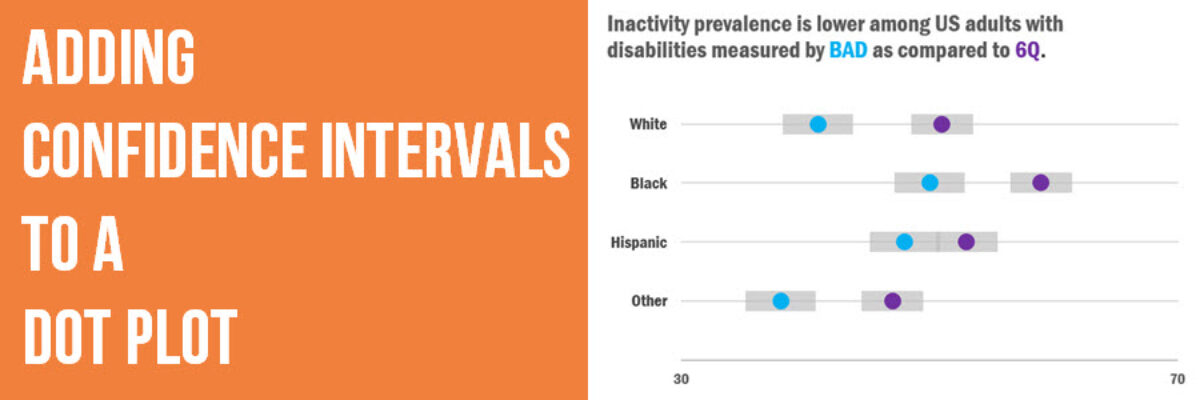
Evergreen Data Visualization Academy member Dana McGuire recently wrote me to ask about her dot plot. She said, “Would there be a way to show the bar or confidence interval somewhere? I have gotten positive feedback on the look of the graph overall, but it is a scientific conference…

Read More

Plain Languaging Statistical Jargon

My main rule of thumb is that you can show measures of variability in your graph so long as you can explain what they mean in an extremely concise subtitle. Translating scientific jargon for a lay audience may be the most challenging aspect of communicating data effectively.

Read More

Adding Standard Deviation to a Dataviz

Do you need to communicate your standard deviations to your audience? No, I mean, really DO YOU? Think hard about that because chances are your audience doesn’t give a crap. They want to know you calculated your standard deviations. They want to know you were meticulous in your number crunching.

Read More