Spectrum Displays

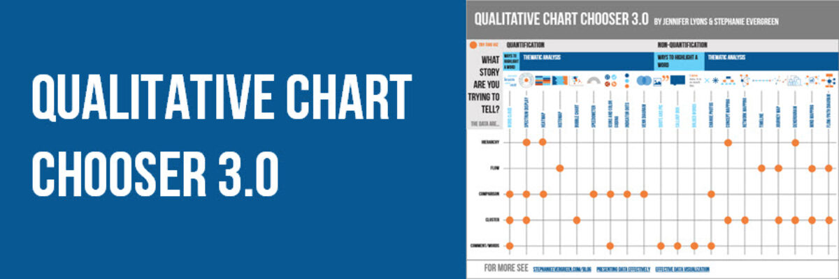
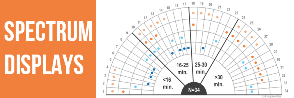
When presenting qualitative data, choose visuals that are broad enough to display the full set of data but are also visualized in a way that allows viewers to pull stories from the data. This is a hard balance to strike, and a spectrum display can do so very well. A…

Read More

Qualitative Chart Chooser 3.0

Why isn’t qualitative data viz as well developed as quantitative data viz? Here at Evergreen Data, we are trying to tackle that. Qualitative data gives us more power to engage people’s hearts and minds. We are able to extend our data story to a more personal level. When we are…

Read More

State of the Union 2016 Slideshow

Dudes, the State of the Union is my Superbowl. I look forward to this event like some people anticipate the Oscars. This is my deal. Why? Because the enhanced version of the SOTU features a data-based slideshow, a perfect study in how graphics can help underscore a point. And, as…

Read More

Theorists Can Have Great Slides Too

I have the coolest gigs. Every year I get to work with the Eleanor Chelimsky Forum keynote speaker to develop a slidedeck that rocks the house. This year, the keynote speaker was Abe Wandersman. I’d seen Abe present in the past and… let’s just say I knew…

Read More

Guest Post: Word Cloud Dog Vomit, An Illustrated Rant

My colleague Humphrey Costello delivers the funniest, snarkiest Ignite sessions at the American Evaluation Association’s annual conference. I’m so happy to give him this platform to articulate the answer to one of the questions I am asked the most, about the phenomenon known as word clouds. 1st ingredient: Long ago,…

Read More

Slide Redesign: Rodney Hopson’s Keynote

I had the joy of working with Rodney Hopson, 2012 President of the American Evaluation Association, on the slides for his keynote talk. The transformation was so huge that I asked Rodney if I could write a blog post about it and the thinking we put into the new design.

Read More