Intentionally Order Your Data

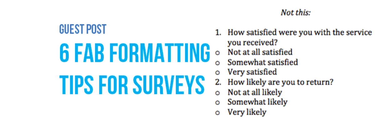
Listen, no one cares about the order we listed the response options on the survey. But most graphs, especially those automatically generated from survey software, showcase the data in that order. And that isn’t useful for anyone trying to interpret the data. Instead, place the bars in order from…

Read More

Anyone Can Do Graphic Design, Even You

This is the kind of post you either love or hate. You hate it if you are a graphic designer. When graphic designers are in my workshops, they usually spend the first part nodding their heads in passionate agreement because I’m educating their research team on…

Read More

Guest Post: 6 Fab Formatting Tips for Surveys

Note from Stephanie: I asked Sheila to write this post because I still get tons of questions from readers about how to take the design I recommend for data visualization and apply it to survey design. I’m not a survey expert, but Sheila is! Hi! I’m Sheila B. Robinson, a…

Read More

Rule of Thirds Template for Slide Layout

While it’s best to sketch a few ideas before you even hit the power button on your computer, once you do open your slideshow software, head first to the slide master and rearrange the default slide layouts into something more attention-grabbing. Try using the Rule of Thirds. The Rule…

Read More

This is What Alignment Looks Like

Ideal alignment is when everything on a page or slide lines up with something else. This sounds pretty simple, right? But there are a lot of implications to consider. First, let’s examine a weak layout. I drew in some red lines, based on the start and end of…

Read More

Eye Gaze & Image Placement

I went to my favorite city in the world a couple of weeks ago – Washington DC. Of course, I didn’t have enough time to explore everything I’d wanted, which included the new Museum of African American History and Culture. But I did catch the promotional signage in the Metro…

Read More

Report Layout in PowerPoint?

I was recently workshopping with a group of evaluators who had bravely submitted their work examples for group critique. In one instance, they had admitted that what I thought were text-heavy slides was actually a full written report. That’s right – they’d used PowerPoint for written report layout. Mind. Blown.

Read More