Add Labels ON Your Bars

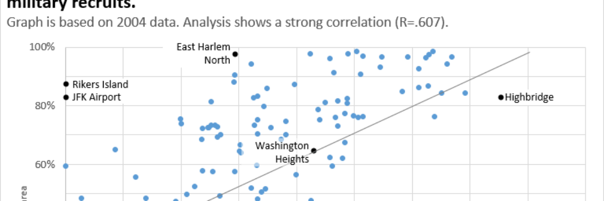
Meg, an Academy student, sent me a great question for our monthly Office Hours call: How do I replicate this? Pretty cool chart, right? It comes from Global Web Index, who put out tons of relevant data in interesting graphs.

Read More

Labels are Used Sparingly

This post is about how to avoid inducing claustrophobia in your data visualizations. Too much text on a graph clutters it up, making readers feel suffocated. So let’s address the checklist item Labels are used sparingly. Sometimes, too much text isn’t the issue. Take…

Read More

Beer Delivery Visualization

Time to tackle some of the more important parts of life. I saw this delivery schedule in a cooler at a DC Whole Foods. Bell’s Beer is from Kalamazoo and we take pretty big pride in our hometown beer. So we (I mean, I) get really geeked when…

Read More