Or webpage. Or dashboard. Any place where you’re assembling data and a message. You need 3 elements. Your one pager needs to be:
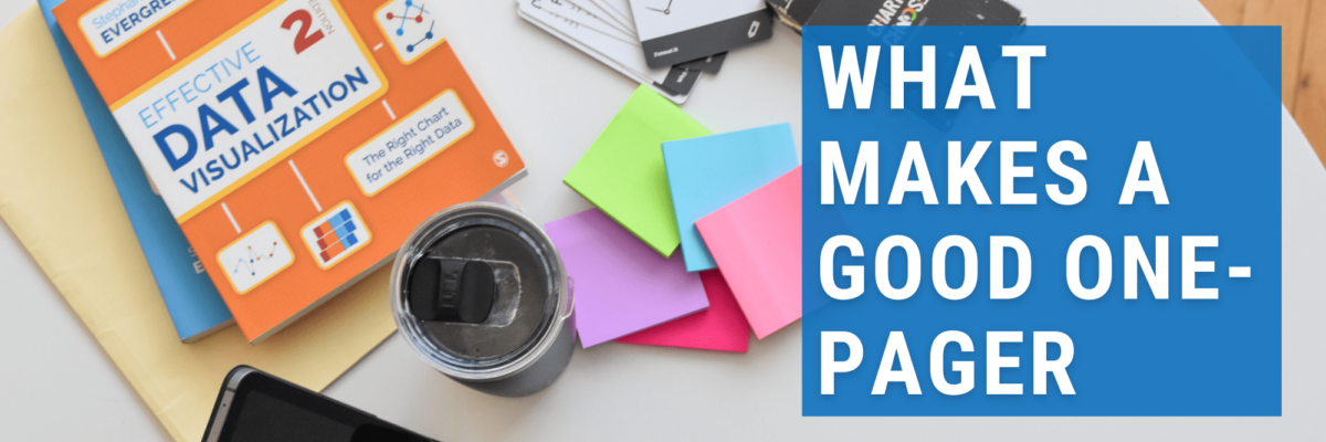
What Makes a Good One Pager
Read More
Or webpage. Or dashboard. Any place where you’re assembling data and a message. You need 3 elements. Your one pager needs to be:
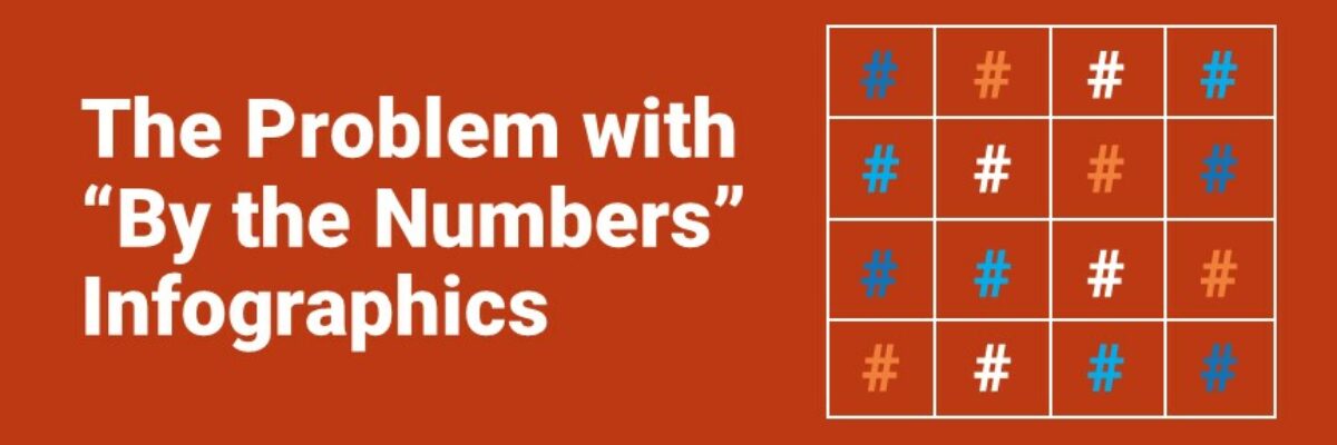
My heart breaks every time I see an infographic called By the Numbers. It’s as if someone in leadership said “Let’s report ‘our numbers’ this year – and put it in one of those infographics.” Someone in Communications got on board because they believe infographics grab attention. And some poor…
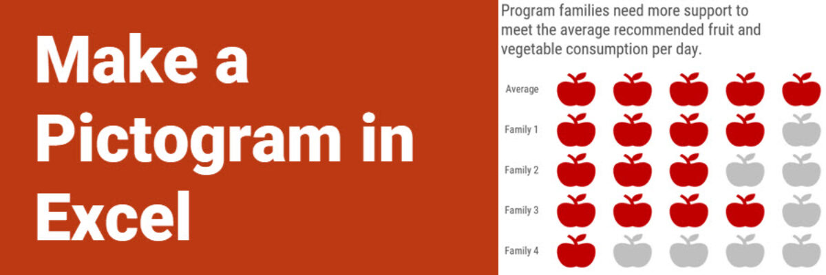
This graph type goes by a lot of names: isotype chart, pictograph, or pictogram. Whichever way, it allows us to use symbols rather than stick with the squares that make up the waffle chart. And it is especially well suited to representing small counts of things that can otherwise be…
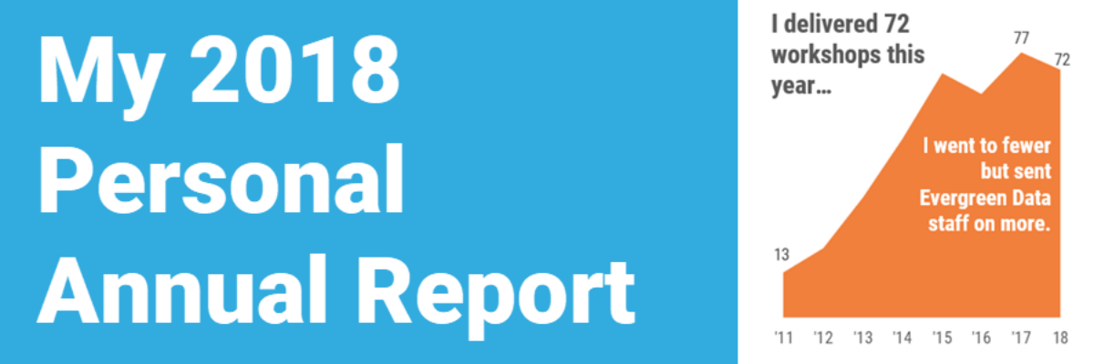
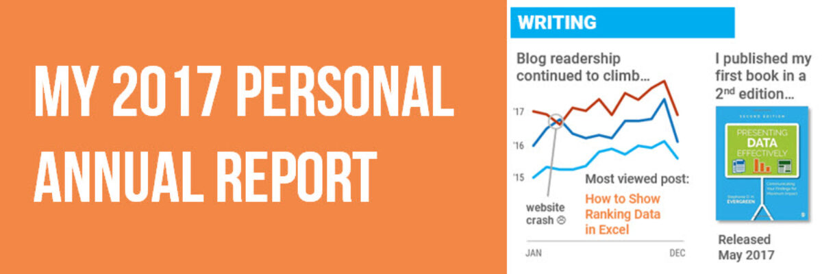
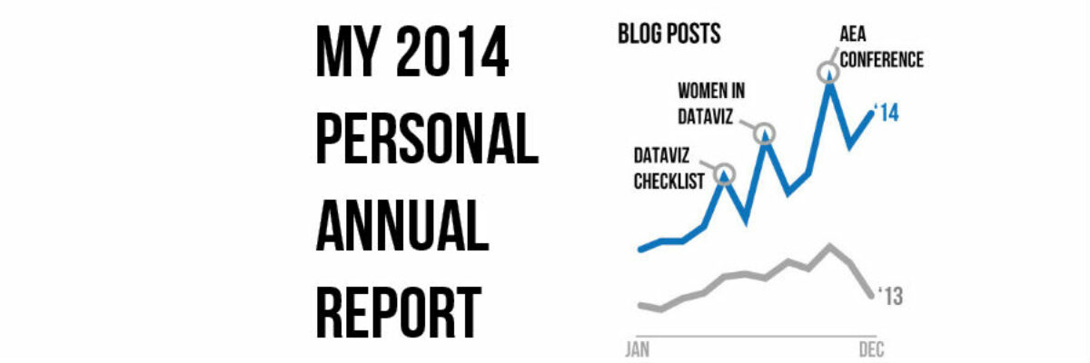
This is my last personal annual report. I’ll tell you why. This year most of my metrics went down. At first, due to cultural conditioning that says “more is always better,” I was like Oh no! Before I go further, let’s pause and break that down. I’ve been creating…
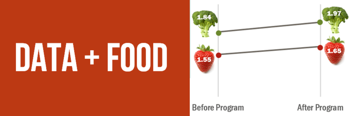
I like to think I’m a foodie but actually I just love to eat. We all do! Food gets people to the meeting. Food grabs folks’ attention. Food gets people talking (between bites, let’s hope). So let’s play to the player and figure out how to get people engaged in…
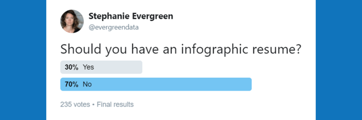
A family member works in IT at a large corporation. She recently forwarded me this resume they received for a job opening. Apparently, it had been passed around the interview committee with the subject line “Best/Worst Resume Ever?”. I personally liked this one for the fact that I know…
Every year at Evergreen Data continues to be the best year ever. When I was younger, I knew my dream job would include meaningful work, awesome people, data, writing, and travel. I just didn’t know at the time how to put all of those things together in one place. Thank…
This is the hardest part of design to get right. It’s what differentiates sloppy, weak design from that which looks tight. It’s the use of a grid. Arrangement matters. It’s the sort of thing that gets talked about in design workshops, but people tend to get so caught up by…
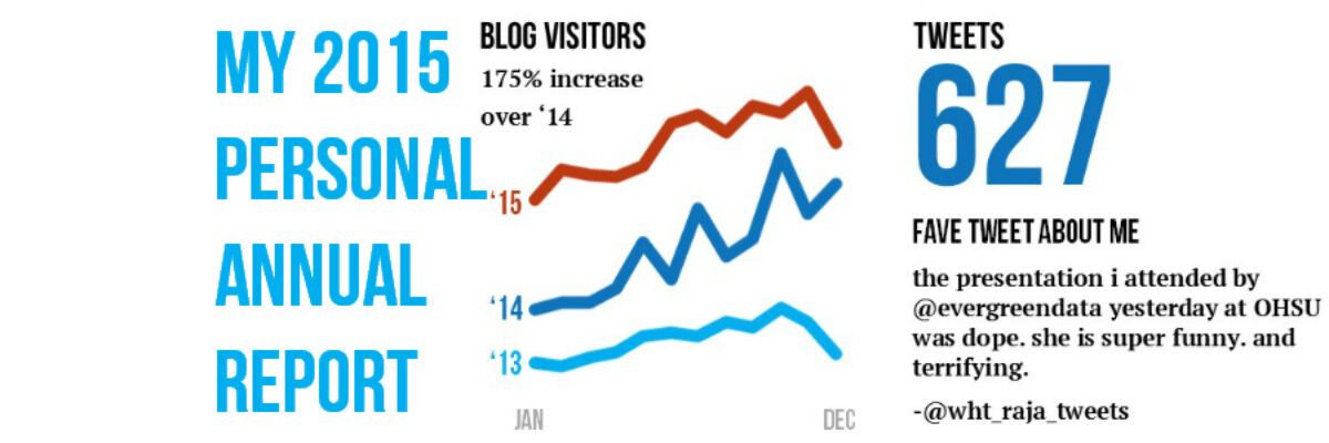
Yowza, what a year! And it is only December 2! I’m writing from my hotel room in Boston. This week I’ve been working with Annie E Casey Foundation (Baltimore), Education Development Center (Boston), and the Ad Council (New York City) – and what a set to round out another awesome year…
Holy smokes it’s been a big year! I finished up my last workshop of 2014 last week and as I got into the cab to head to the airport, a wave of major sleepiness hit me hard. I’ve been super crazy productive and worked with some of the most amazing…