How much is “too much?” I’m sure you’ve seen that eye glaze from time to time. The answer is actually deceptively simple.
How Much Data Viz is Too Much
Read More
How much is “too much?” I’m sure you’ve seen that eye glaze from time to time. The answer is actually deceptively simple.
Have you ever worked for a client where you were going to have access to data so close to the chest that you had to sign a form acknowledging you could no longer trade their stock? That’s me, often, when I work with Fortune 100 companies.
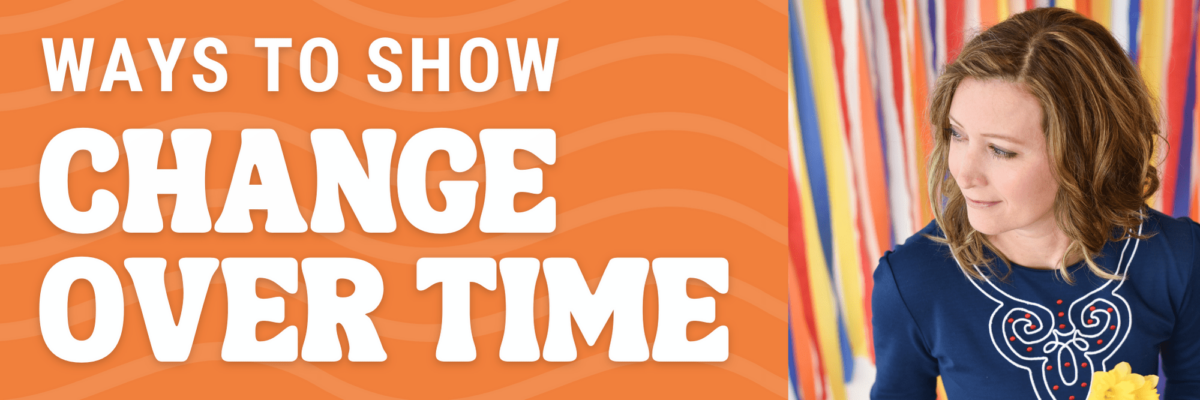
If your data involves years / quarters / months / weeks / you see where I’m heading with this, you’ve got a story about change over time. What’s the best way to visualize that data?
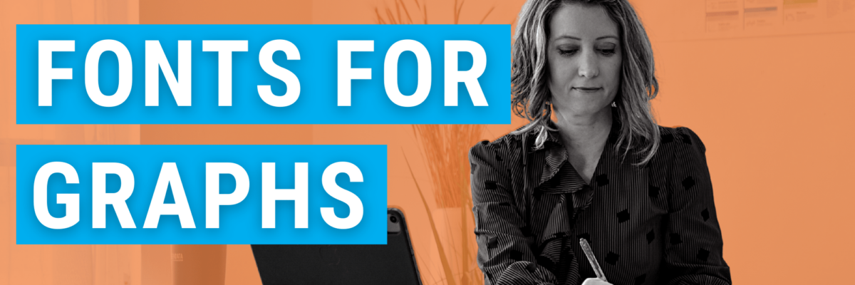
When it comes to your graphs, you need condensed fonts.
Everyone wants a dashboard. But making a GOOD dashboard can be as hard as snagging a selfie with Beyonce. The friction I see most often is because the dashboard software is confusing to use. It’ll get you feeling like you’re groping around in the dark for the light switch.
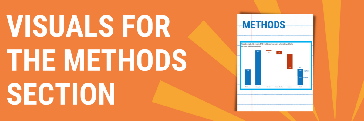
You can tell when someone is getting their data viz eye well-honed because they start asking where ELSE can I include visuals that will better explain my work? That’s Sue. She had grown comfortable with high-impact, story-telling charts in the Results section of her reporting but…
I am a data nerd. I grew up, professionally speaking, designing studies, collecting data, and trying to get people to make use of the analysis and results. After I married a graphic designer, I realized that no one was going to pay attention to my amazing, glorious, wonderful data if my…
The biggest a-ha moment that came from my dissertation was discovering what shaky ground we stand on in data visualization. When my friends heard I was going to study data visualization, they filled my desk with books from Edward Tufte, Stephen Few, and even Garr Reynolds. I was thirsty for…
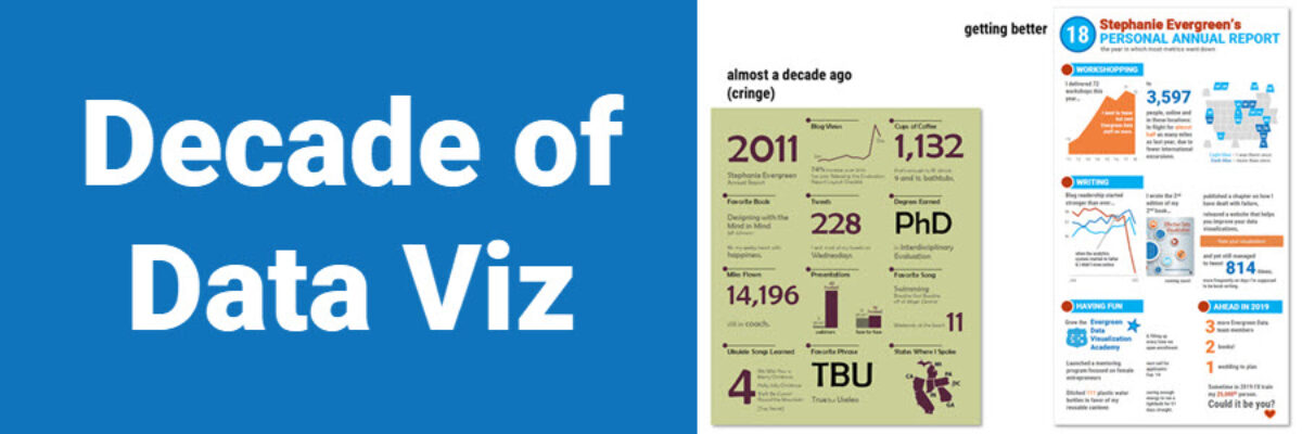
Well, that just flew by. Ten years ago, I was in the throes of writing my dissertation on Presenting Data Effectively, knowing I had focused on a topic that the world was hungry for, even if they didn’t know it yet. I had collected enough literature and data to know…
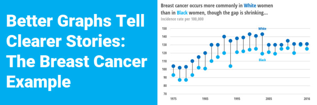
Nothing wrong with this breast cancer line chart, but it’ll only tell a certain data story. Learn some alternative chart types for better data storytelling.