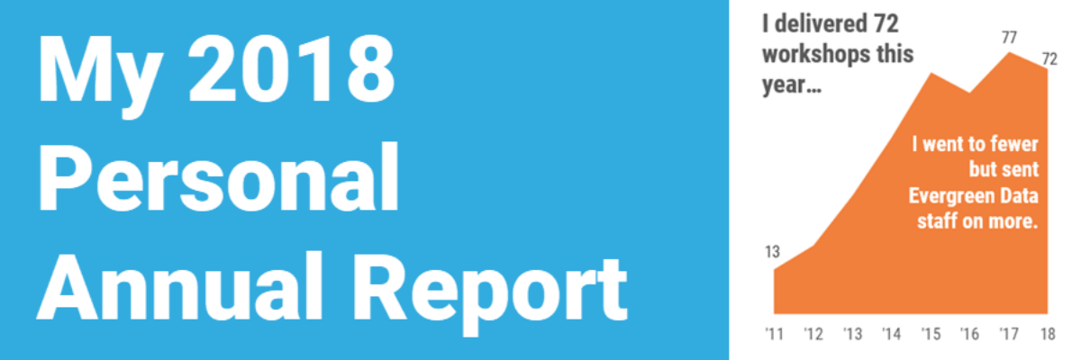
This is my last personal annual report. I’ll tell you why. This year most of my metrics went down. At first, due to cultural conditioning that says “more is always better,” I was like Oh no! Before I go further, let’s pause and break that down. I’ve been creating…
graphics
Capture Qualitative Data with Change Photos
Engaging our audiences in the complex, intricate stories of our qualitative data can be difficult. Make qualitative comparisons come alive with change photos or graphics. The hurricane in Puerto Rico left many devastated and without power, homes, and community. It is hard to imagine the damage that was done. One…
Color Psychology
As I usually do in my workshops, I talked to a group in Warsaw, Poland about how we should use color intentionally in our data visualization and that, in fact, the color choice itself can help us tell our story. I prepared a little activity around this issue, in…
Guest Post: Sid Ali on Visual – Yet Formal – Reports
Stephanie’s Note: So so often I get emails from readers asking for examples of how full reports can incorporate more graphic design while still maintaining credibility and seriousness, especially for more conservative audiences. Sid’s report is a nice example of how well-considered images can boost engagement and appeal. Nice work,…
Labels are Used Sparingly
This post is about how to avoid inducing claustrophobia in your data visualizations. Too much text on a graph clutters it up, making readers feel suffocated. So let’s address the checklist item Labels are used sparingly. Sometimes, too much text isn’t the issue. Take…
Largest Photo Service Gives Images Away for “Free”
Last month the world’s largest photo service announced that it would be giving away it’s photos for free. Say what?? Well, it was something like that. Get excited, but not too much. Getty Images announced that a portion of its gigantic, high-quality collection would be available at no cost. Sounds…
More Images: The Dissertation Breakdown
At this time last year I was putting the final touches on my dissertation manuscript format and preparing for my defense. I looked at the extent of graphic design use in evaluation reports. I gathered about 200 summative evaluation reports from the repository at Informal Science Education, trained…
This is What Alignment Looks Like
Ideal alignment is when everything on a page or slide lines up with something else. This sounds pretty simple, right? But there are a lot of implications to consider. First, let’s examine a weak layout. I drew in some red lines, based on the start and end of…
Image Searching Made Easy(er)
We all love to see large engaging images in evaluation reporting, but it sure can be a pain in the butt to be the one behind the computer monitor, scrolling through pages of images in search for the right one. Typically, this process takes weeding through a lot of eye-strain…