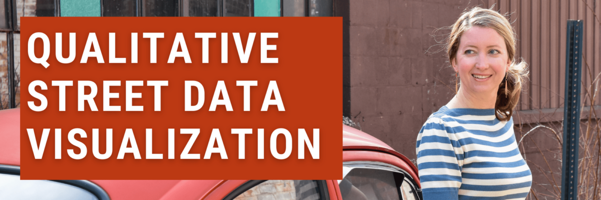
Let me add three new qualitative data visualization ideas to your library: Placement Maps, Timeline Ticks, and Sliders.
Qualitative Street Data Visualization
Read More
Let me add three new qualitative data visualization ideas to your library: Placement Maps, Timeline Ticks, and Sliders.
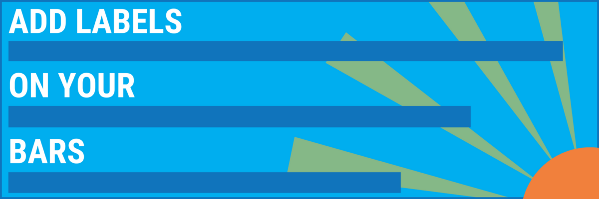
If your data involves years / quarters / months / weeks / you see where I’m heading with this, you’ve got a story about change over time. What’s the best way to visualize that data?
Meg, an Academy student, sent me a great question for our monthly Office Hours call: How do I replicate this? Pretty cool chart, right? It comes from Global Web Index, who put out tons of relevant data in interesting graphs.
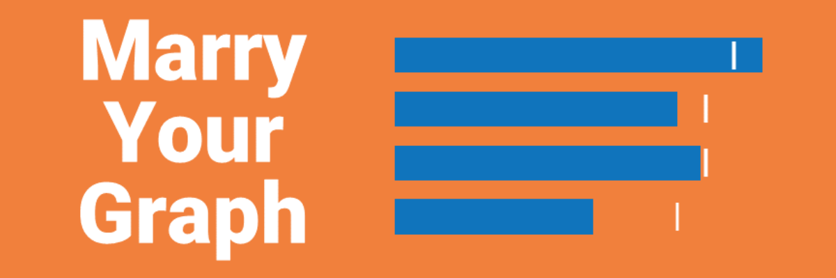
I am a data nerd. I grew up, professionally speaking, designing studies, collecting data, and trying to get people to make use of the analysis and results. After I married a graphic designer, I realized that no one was going to pay attention to my amazing, glorious, wonderful data if my…
Have you ever accidentally taken one step too far down the internet rabbit hole? This has happened to me more than once when I’m trying to google the solution to why my chart isn’t working. I click into a Q & A forum that teases the answer – but the…
Here’s the thing: Your graph isn’t ever just going to chill out in your Excel file or Tableau worksheet. It’s going to live a life elsewhere, like in a dashboard, a slide, or a webpage. So when we make our graphs, we have to think about their future home environment.
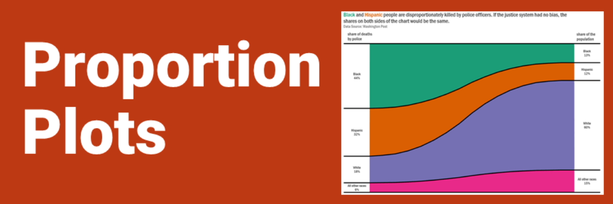
Proportion plots help us compare the share of a population between two metrics. It uses length on the left and right side of the chart and connects the lengths by a band in the middle that swoops a lot if there is disproportionality and stays pretty even if the proportions…
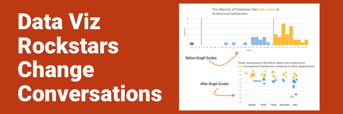
Audrey Juhasz has been in The Evergreen Data Certification Program for about 4 months. In that time, she has learned some super do-able and highly effective lessons that have totally changed the way she and her team are able to talk to each other. This data viz rockstar is changing…
This blog post is part of a series called Asked and Answered, about writing great survey questions and visualizing the results with high impact graphs. Dr. Sheila B. Robinson is authoring the Asked series, on writing great questions. Dr. Stephanie Evergreen is authoring the Answered series, on data visualization.
This blog post is part of a series called Asked and Answered, about writing great survey questions and visualizing the results with high impact graphs. Dr. Sheila B. Robinson is authoring the Asked series, on writing great questions. Dr. Stephanie Evergreen is authoring the Answered series, on data visualization. View…