So what do you do if your audience is asking you to show all the data? Here are a few solid ideas plus one key question to ask.
Show All the Data
Read More
So what do you do if your audience is asking you to show all the data? Here are a few solid ideas plus one key question to ask.
While ANY chart can fight for equality, if you plug the right data into it, these four in particular make the story jump off the screen.
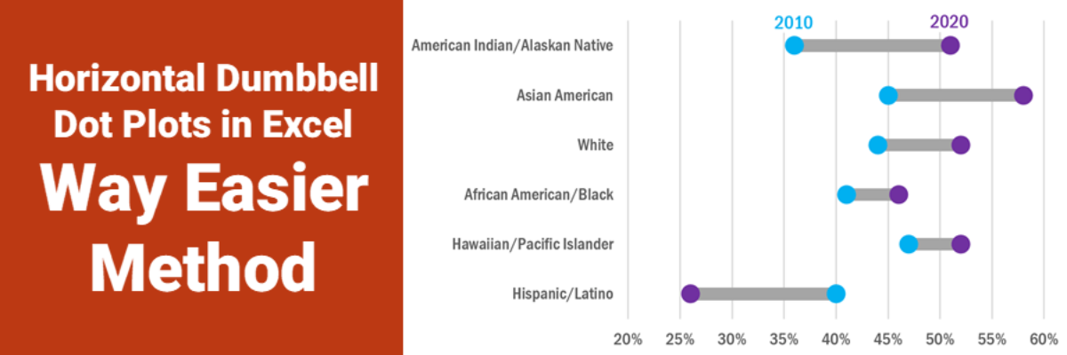
Ok, babes, prepare to be amazed. It used to be that making this viz was pretty tedious but I’ve recently refined a totally new hack (thanks to a lollipop chart example provided by Sevinc Rende, one of my mentees) that makes this soooooooo easier. It used to be Rockstar…
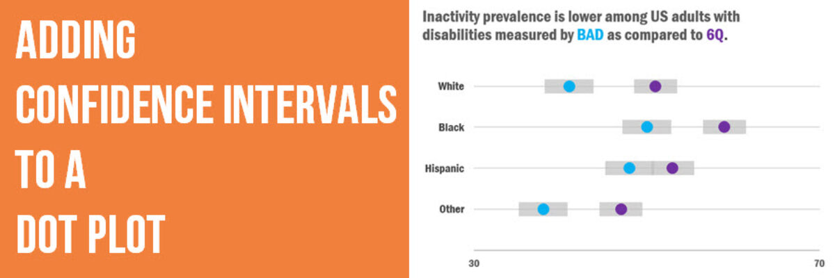
Evergreen Data Visualization Academy member Dana McGuire recently wrote me to ask about her dot plot. She said, “Would there be a way to show the bar or confidence interval somewhere? I have gotten positive feedback on the look of the graph overall, but it is a scientific conference…
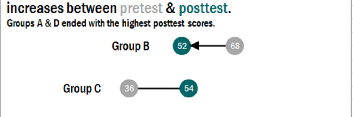
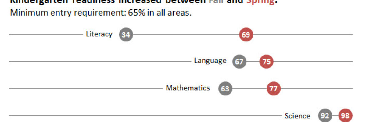
In case it wasn’t clear, I freakin love dot plots. They are amazingly easy to read, beautifully simple in their display. I was making these babies for some clients a little while ago, before and after dots for about 25 variables in one graph.
A while ago I was at a Naomi Robbins’ workshop and she was pretty emphatic that dot plots are the better method of visualization, as compared to bar charts. The reason goes back to Cleveland’s early experiments on visual perception, which found that humans most accurately interpret locations on line,…