You’ll leave with at least 25 immediately implementable strategies & a list of the Black, Brown, Indigenous, queer, and disabled visualizers to follow as you work to become an ever better visualizer.
Ways to Make More Inclusive Data Viz
Read More
You’ll leave with at least 25 immediately implementable strategies & a list of the Black, Brown, Indigenous, queer, and disabled visualizers to follow as you work to become an ever better visualizer.
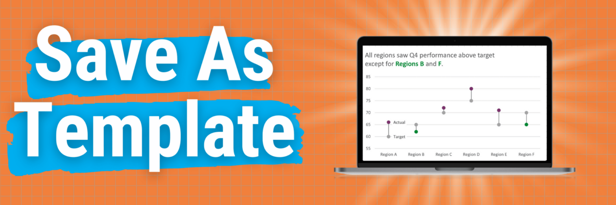
This is my A+ #1 100% best time-saving hack for making graphs in Excel. When you go through the process of making that one graph that’s totally perfect, you can save it as a template so it becomes, essentially, your new default graph. Here’s how. Right-click somewhere in…
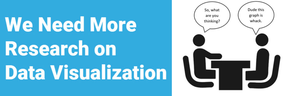
I wish that every awesome data viz presentation ended with each coworker blasting a confetti popper over your head. The reality is that when your data viz sucks, you know it loud and clear. When it sings, you often can’t tell. This post is not going to provide an anatomy…
You might have landed here because you thought this was going to be a post full of snarky commentary on mediocre graphs. It isn’t. In fact, I’m not going to include a single data viz. Because what makes a data viz suck or sing isn’t just about its outward…
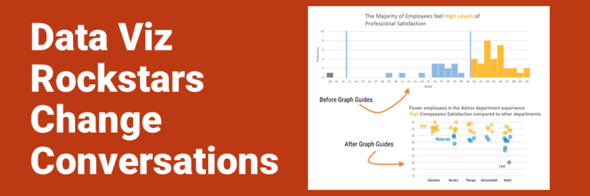
Audrey Juhasz has been in The Evergreen Data Certification Program for about 4 months. In that time, she has learned some super do-able and highly effective lessons that have totally changed the way she and her team are able to talk to each other. This data viz rockstar is changing…
My heart breaks every time I see an infographic called By the Numbers. It’s as if someone in leadership said “Let’s report ‘our numbers’ this year – and put it in one of those infographics.” Someone in Communications got on board because they believe infographics grab attention. And some poor…
Stephanie’s Note: Dr. Sena Sanjines just wrapped up her dissertation, part of which measured whether my Data Visualization Checklist is worth its salt. Here are her findings. My name is Sena Sanjines and I’m an evaluator in Hawai‘i slightly obsessed with figuring out what makes people use, or not use,…
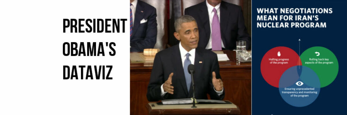
I realize it’s completely taboo to write about current events six months after they’ve happen but I DON’T CARE. One of my favorite events of the year is watching the enhanced version of the State of the Union. Not the regular view – the enhanced view. One side of the…
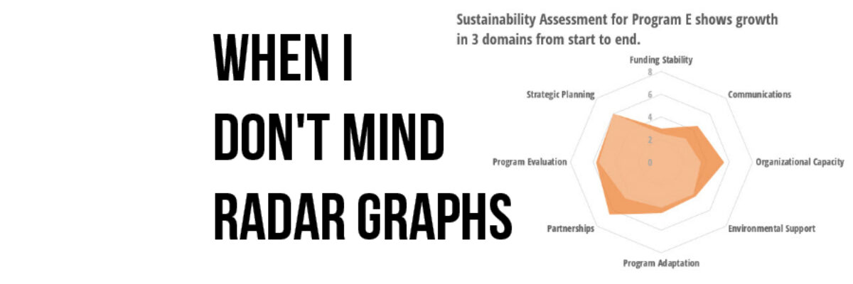
Most of the time, I think radar graph are deployed wrong. They are designed to show percentages along several categories – like a bar graph could – but the axis are distributed around a central point, such that the percentages link together and create a shape. Choosing a radar graph,…
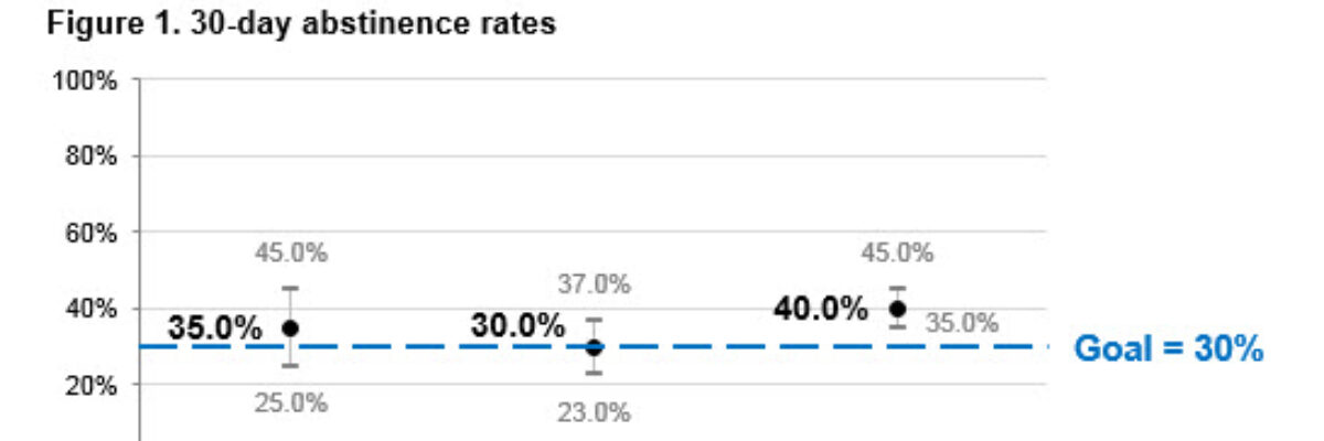
Hi there! I’m Angie Ficek and I’m a program evaluator at a small evaluation consulting firm called Professional Data Analysts, Inc. (PDA) in Minneapolis, MN. In a previous post, Stephanie wrote about adding standard deviations to a dataviz. I responded to her post with an example of…