You’ll leave with at least 25 immediately implementable strategies & a list of the Black, Brown, Indigenous, queer, and disabled visualizers to follow as you work to become an ever better visualizer.
Ways to Make More Inclusive Data Viz
Read More
You’ll leave with at least 25 immediately implementable strategies & a list of the Black, Brown, Indigenous, queer, and disabled visualizers to follow as you work to become an ever better visualizer.
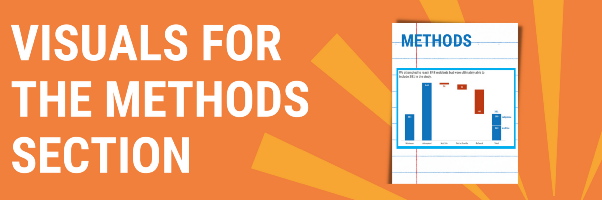
You can tell when someone is getting their data viz eye well-honed because they start asking where ELSE can I include visuals that will better explain my work? That’s Sue. She had grown comfortable with high-impact, story-telling charts in the Results section of her reporting but…
Here’s the deal: People primarily look at pictures. That’s why we visualize data – to get people to look at it. But if we waste the short amount of attention people are willing to extend to us by showing them visuals that don’t convey…
The simplest way to show many types of data is through a column or bar chart, ordered greatest to least. These will work just fine, most of the time. When do they fall short? Well, when the values are all high, such as in the 80-90% range (out of 100%). Then…
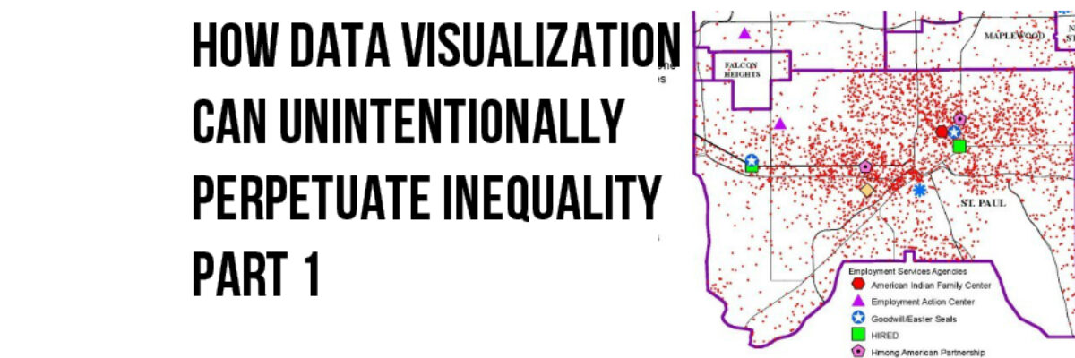
Sometimes, whether we know it or not, the choices we make when we visualize data can reinforce and even perpetuate racial disparity and it’s time that we talk about it. The lull of the computer monitor and the belief we are just working with numbers can make us lose sight…
Most of the time, I think radar graph are deployed wrong. They are designed to show percentages along several categories – like a bar graph could – but the axis are distributed around a central point, such that the percentages link together and create a shape. Choosing a radar graph,…
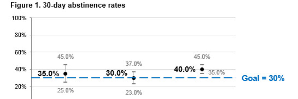
Hi there! I’m Angie Ficek and I’m a program evaluator at a small evaluation consulting firm called Professional Data Analysts, Inc. (PDA) in Minneapolis, MN. In a previous post, Stephanie wrote about adding standard deviations to a dataviz. I responded to her post with an example of…