Everyone wants a dashboard. But making a GOOD dashboard can be as hard as snagging a selfie with Beyonce. The friction I see most often is because the dashboard software is confusing to use. It’ll get you feeling like you’re groping around in the dark for the light switch.
charts
Shaky Data Viz Advice
The biggest a-ha moment that came from my dissertation was discovering what shaky ground we stand on in data visualization. When my friends heard I was going to study data visualization, they filled my desk with books from Edward Tufte, Stephen Few, and even Garr Reynolds. I was thirsty for…
Decade of Data Viz
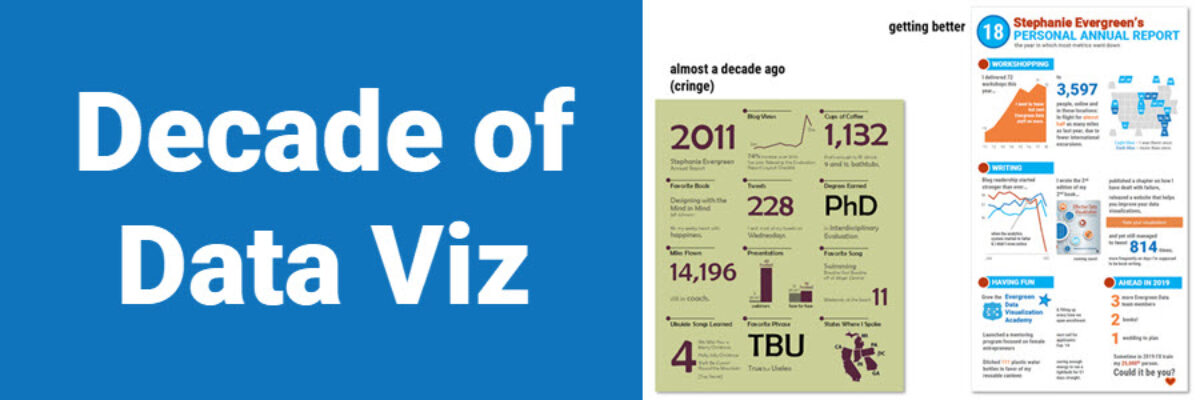
Well, that just flew by. Ten years ago, I was in the throes of writing my dissertation on Presenting Data Effectively, knowing I had focused on a topic that the world was hungry for, even if they didn’t know it yet. I had collected enough literature and data to know…
Announcing The Chart Starter Series
So, hey, heads up: The Chart Starter Series is probably not for you. If you know my work well, you are probably already a dataviz whiz. The Chart Starter Series is for your colleague. You know the one. The one who keeps asking you to make their graphs. Tell…
What to Look for in a Data Visualization Workshop
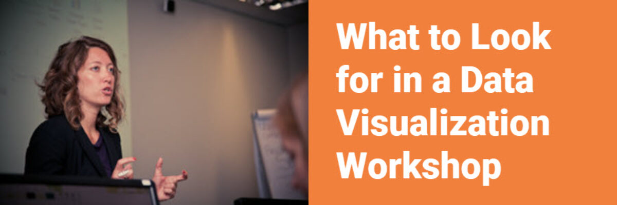
Data visualization workshops are an investment into your growth as a leader in your field. They should, if they are good, produce immediate returns on your investment which should show up as significantly increased use of your work, attention from existing and potential customers and partners, and more revenue.
Use Proximity for Better Data Storytelling
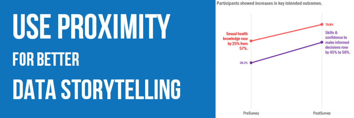
Recent clients, Planned Parenthood Federation of America, faced a design problem so common they didn’t even know it was a problem. They were working on communicating some data from a program that aims to educate on healthy sexuality and reproductive health. They surveyed participants at the start and end of…
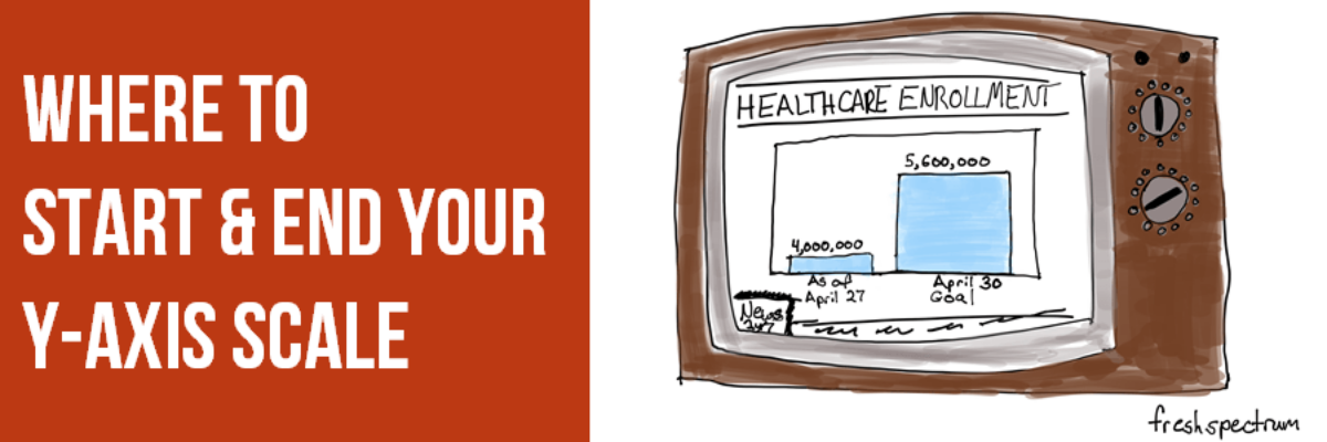
Where to Start and End Your Y-Axis Scale
The Y-Axis Debate is one of the most hotly discussed among cool data nerds, like me and my friends. Going out for drinks with me is either a blast or a bore, depending on your nerd level. So let me clarify the parameters of the debate, including where nerds mainly…
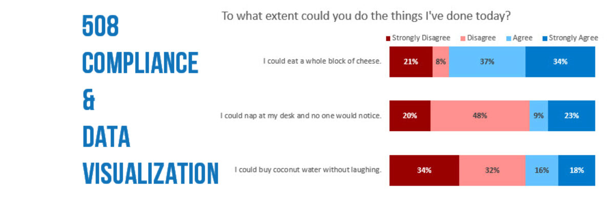
508 Compliance & Data Visualization
508 Compliance became A Thing to Deal With in 2000 and 15 years later people still have questions about how it works. I get questions about how to be 508 compliant in nearly every workshop. 508 compliance essentially means that people who produce things on the web for any federal…
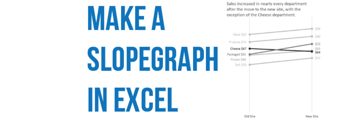
Make a Slopegraph in Excel
Slopegraphs are a newer graph type with powerhouse capabilities. They rely on Excel’s line graphing feature but they don’t necessarily have to show change over time. Slopegraphs play into our ability to judge slope fairly well. For this reason, they are perfect for highlighting the story of how just one…
Directly Labeling in Excel
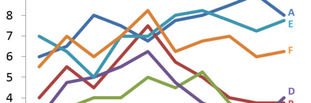
It’s time to ditch the legend. You know – the legend, the key, the thing to the right of the graph that tells the reader what each piece of your graph means. We don’t need it. Legends are actually hard for many people to work with because they put a…
