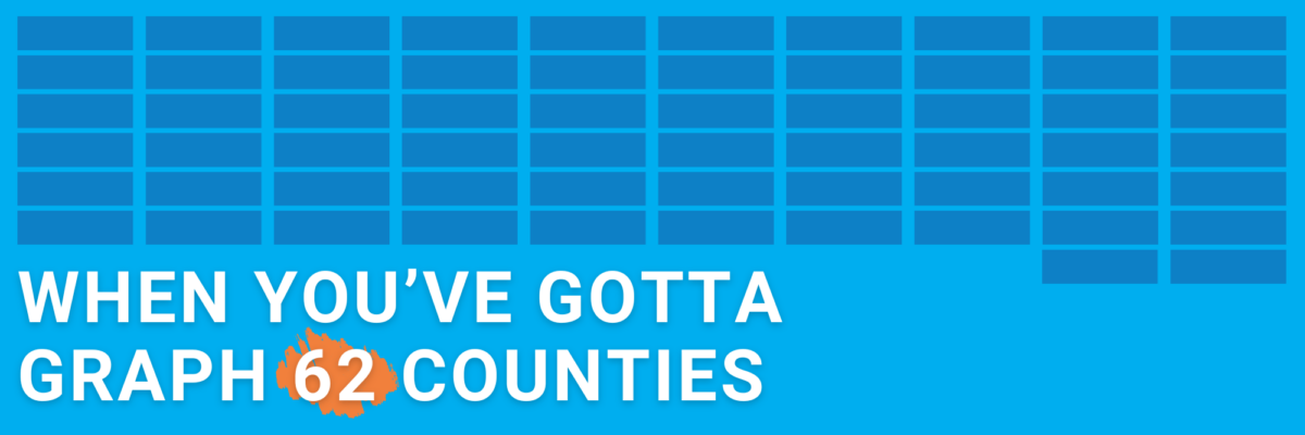
or countries or students or departments or… you just have a lot of categories to squeeze into your chart. How to proceed without creating a hot mess?
When You’ve Gotta Graph 62 Counties
Read More
or countries or students or departments or… you just have a lot of categories to squeeze into your chart. How to proceed without creating a hot mess?
People interpret symbols as pictures, not words. That makes symbols, like $, more instantly recognized and understood than words, like dollar.
I gave two AI tools – ChatGPT and Gemini – two simple datasets and asked them to generate insightful titles.
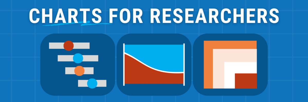
Announcing my new chart chooser with 22 qualitative data visualization options.
Use your chart title to communicate a takeaway idea. What if your takeaway idea is complex or multi-part? Employ three dots.
If you want your data to get consumed by more people, you have to design it for viewing on social media platforms where they consume visuals.
Henceforth I’m calling for a ban on pie charts in annual reports. The ban will be lifted when a company is able to credit a data viz designer (even an internal one) as a contributor to the report.
Of course your chart arsenal includes your trusty bars & scatters. Add these 3 to your mix to gain clarity, get more eyeballs, be better understood.
When it comes to your graphs, you need condensed fonts.
Does the story told in the headline match the data used to bolster it? It’s really common for people to read a tweet and take it as the truth. Especially when it comes from official accounts like the White House. And while the Trump White House was notorious for it’s…