Visuals for the Methods Section

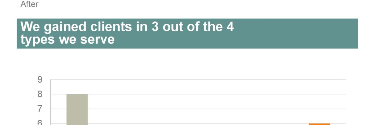
You can tell when someone is getting their data viz eye well-honed because they start asking where ELSE can I include visuals that will better explain my work? That’s Sue. She had grown comfortable with high-impact, story-telling charts in the Results section of her reporting but…
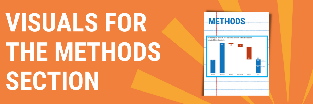
Read More

Add Labels ON Your Bars

Meg, an Academy student, sent me a great question for our monthly Office Hours call: How do I replicate this? Pretty cool chart, right? It comes from Global Web Index, who put out tons of relevant data in interesting graphs.

Read More

Make A Lollipop Graph in Excel

The simplest way to show many types of data is through a column or bar chart, ordered greatest to least. These will work just fine, most of the time. When do they fall short? Well, when the values are all high, such as in the 80-90% range (out of 100%). Then…

Read More

When I Don’t Mind Radar Graphs

Most of the time, I think radar graph are deployed wrong. They are designed to show percentages along several categories – like a bar graph could – but the axis are distributed around a central point, such that the percentages link together and create a shape. Choosing a radar graph,…

Read More

Adding a Benchmark Line to a Graph

This simple line packs so much power. Adding a benchmark line to a graph gives loads of context for the viewer. Here’s how to make one right inside Excel. It’s so easy you might pass out. My data table looks like this: I have my data and I have the benchmark…

Read More

Before & After Slides: Stay on the Side of Simplicity

My friend, Kurt Wilson, and I just wrapped up a contract to revise a set of slides – and the graphs within – for a big international client I can’t name. Here I’ll walk through one of the original slides and our revision of it. Keep in mind that these…

Read More

Making Back-to-Back Graphs in Excel

Let’s say we’re interested in comparing how two groups – oh, teachers and principals – responded to a survey. One way to visually display that comparison would be a bar graph, where each question had two bars, one for teachers and one for principals. It’s helpful in some ways, but…

Read More