If you do nothing else to improve a weak visualization, you’ll still seriously improve its interpretability by giving it an awesome title.
Generally we use weak titles that don’t really tell us the point of the visualization:

I think this is because we make our graphs in Excel, which pops in the two-word “Chart Title” and so we think we need to replace that with two equally generic words like “Graduation Rates”. And this puts our audience in a really crappy position of having to figure out what we are trying to say about graduation rates, as if they are mind readers. They also must spend a lot of time decoding the visual display of the data to see if our point is discernible when, chances are, the data could convey many points. And that’s cool – data are rich and that’s why we show them – but our point is lost with weak titles.
We can use that precious title space to frame our message such that when the visual is cut out of our report and spread all over Twitter, our point remains intact.

Coming up with a good title is deceptively tricky because it requires you to know your point, to have figured out what you are trying to say. And that can be half of the work of solid data analysis and communication right there. But in the end, it’s a very small change to the graph that will take you the farthest. That’s why a good title is the very first point on the Data Visualization Checklist. It’s powerful.
But I sometimes see groups who completely reject the idea of a strong graph title. Usually these are academics or those with a heavy academic upbringing. They tend to think that moving from “Generic” to “Declarative” will somehow bias the audience, as if the audience wants to spend their time figuring out your point. There is one audience that doesn’t mind muddling through unclear data – it’s other academics. So if you are reporting for a journal article, sure, vague titles might be appropriate. But the rest of the time we are usually reporting to real people who have to make actual decisions and actions based on our work and they have paid you to cut to the chase. In other words, using strong titles makes us less annoying.
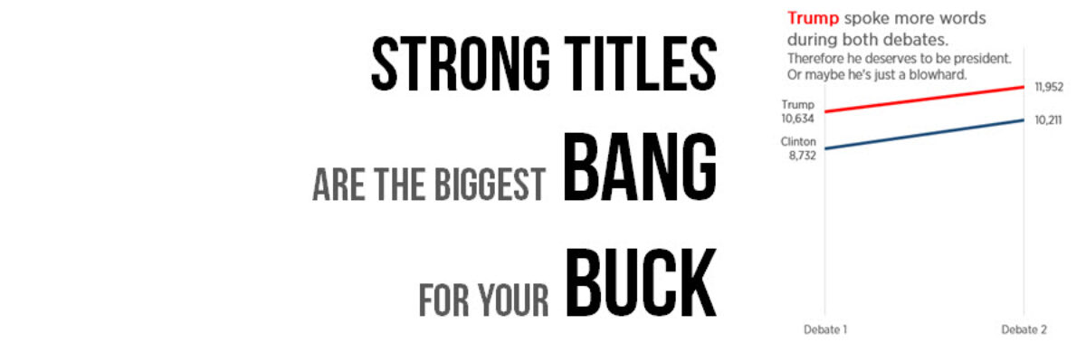
It doesn’t have to be a strong-armed title, like “Trump spoke more words at the debate, so he’s obviously a blowhard.” It can just be “Trump spoke more words at the debate.” Which is still way better than “Number of Words Spoken at Debate.” There’s a middle ground here where the title describes what the visual shows so that the message is conveyed both visually and semantically, without jumping to conclusions beyond the data.

Recent research also showed that awesome titles are a key element of what make a visualization memorable. Borkin and team used eye-tracking methods to detect that viewers tended to look at the visual first and then at the title. Viewers spent more time on the title particularly when the visual wasn’t something unique, like a social network diagram. But regardless of whether the visual itself was unique or standard, when asked to describe the visual later on, viewers were most accurate in describing those visuals that had a strong title. In fact, their descriptions were often very close paraphrases. Strong titles – the kind that are complete sentences with subject-verb agreement – hang in people’s heads.
Shoot for a title that is a whole, complete thought, put it at the top of the graph, in the upper left hand corner, left-justified. It’s a small change with big impacts.
