Anna Harms knows when the jig is up. Part-way through my 1 day workshop on Presenting Data Effectively, she knew what change had to happen (and fast). So fast, she didn’t hesitate to walk right up to me and say, “We are working so hard on our reports but there’s no way anyone could (or would want to) pick them up and read them.” I almost kissed her honest face right then.
Her group (Michigan’s Integrated Behavioral and Learning Support Initiative)
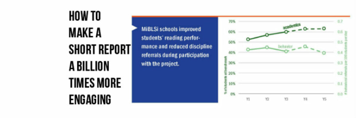
had been making major strides in helping schools to support kids in reading and behavior. Their support model was reducing problem behavior and suspensions and raising reading scores all over the state. They had been recognized as national leaders for their efforts but Anna realized they needed a big time game changer to have their reporting reflect their story. Realization led to working together on a radical overhaul of stakeholder reports.
The team had been used to churning out grant reports that looked like this:

And she knew the majority of their partners and stakeholders would never read something like that. If they did read it, they’d be unlikely to walk away with any major insights or lasting memories of the information. No kidding. Would you? So often smart people sit at computers typing out reports while their spirit cries out “what impact will even this have??” What a terrible feeling. What a waste of opportunity.
Anna seized it and aimed for a 6-8 page report brief with high visual impact and more likely reader engagement. We worked together to establish templates and style guides, revise common graphics, and edit content until the brief bled. We started showcasing their work in briefs like these:

Anna and her team are software savvy but we still kept the programs to Publisher (for layout), PowerPoint (for common graphics), Excel (for graphs), and ArcGIS (for maps).
And talk about game change. When these briefs rolled out, the MiBLSi team finally had a consistent and beautiful vehicle for communicating the work of the organization and its impact. State-level leaders could point to the value of the project’s work in the state. Local schools could point to the results and what it had meant for them.
This was just the beginning of a journey. Next, MiBLSi started tackling data dashboards, bringing the same design eye and heavyweight data communication. Teams have been using these over the past year to make faster, better-informed decisions to improve student outcomes. For some schools and districts, the dashboards improved their efficiency with data-based decision making. For others, the data dashboards have filled a void where data were previously not available or consistently brought to the table.
In other words, the changes we made to MiBLSi reporting seriously amped up how useful the data could be for communication, action, and decision-making. This is how you make research engaging.
