While it’s best to sketch a few ideas before you even hit the power button on your computer, once you do open your slideshow software, head first to the slide master and rearrange the default slide layouts into something more attention-grabbing.
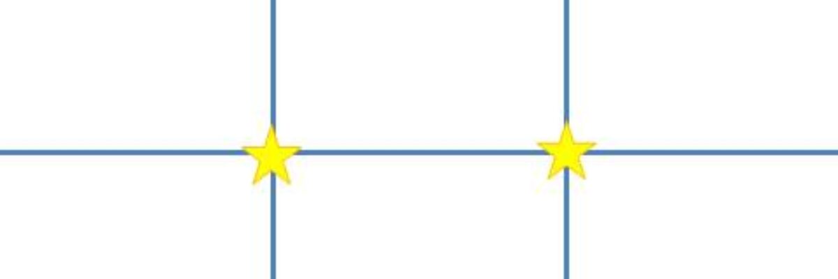
Try using the Rule of Thirds. The Rule of Thirds is a layout idea that comes from the field of photography. It essentially divides the slide into three horizontal rows and three horizontal columns.
There are a couple of different ways to use the Rule of Thirds. Some people will let it guide where to put images, such that the images consume one, two, or all three of the thirds, either horizontally or vertically. Other people will work to put key elements at those star points where the horizontal and vertical lines intersect.
The idea is that placement along a third makes everything off-center, which creates visual interest. Centered content (text or images) tends to feel really balanced and formal (by that I mean really boring).
The easiest way to work with the Rule of Thirds is to draw in the lines in your slide master on master slide 1. Then rearrange the default text boxes in the rest of the master slides so they align to the Rule of Thirds. Close the master view and develop your slides. When you are done, you’ll just go back into the slide master and delete the lines from master slide 1.  IN FACT, look out – here’s Rule of Thirds Template for PowerPoint 2010 you can download where I have already drawn the lines in the slide master and rearrange the default boxes. You could, in theory, just close the master view and get to work on your slide creation. In practice, you might want to change fonts and such first.
Here are a few slides I developed with the Rule of Thirds, using the fill-a-third approach:
Text in 1 vertical third, image in 2
Image in 1 vertical third, text in 2
Image in all 3 vertical thirds, text in 1
Text in 1 horizontal third, image in 2
Got the idea? Awesome, download the Rule of Thirds Template and get going!


