Danielle, a member of my Evergreen Data Visualization Academy, submitted a question to our monthly Office Hours webinar about how to show ranking data. She sent this survey question:
There are eight categories below. Rank each item to continue to the next page. Rank the following services in order of preference (most preferred item on top), where 1=most preferred to 8= least preferred.
Service A __
Service B __
Service C __
Service D __
Service E __
Service F __
Service G __
Service H __
and she asked:
I use Qualtrics, and right now this survey has collected approximately 2,900 responses. I will be asked to provide overall results for this question to the stakeholder. How can I show that overall, people assigned a specific rank to a specific service?
Ranking data can be tricky to know how to visualize because it is but isn’t parts of a whole. The data will likely arrive from Qualtrics in a table, where each row sums to 2,900 (assuming a perfect world with no missing data).

Only Qualtrics will probably sort the data in the order the services were listed on the survey and I re-sorted them here to run from least to greatest on the #1 ranking.
The solution to knowing what type of visual is best is to think about what your audience will want to see. Those stakeholders will come at you wanting to know which service was ranked highest. So a simple bar chart, ordered greatest to least (that’s why I messed with the table) will be the clearest visual. Note that I’m only graphing the first two columns in the table – just the service names and how often they were ranked #1.

Some stakeholders might want to know a little more – like top 3 ranking – but a bar chart is still probably the simplest solution here. (And once you settle on bar chart, you can always branch out to a dot plot or a lollipop graph).
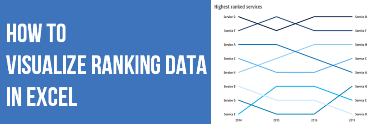
This is about as far as you can take the data, given the one question we see here on a single survey. But if you were to ask this question to the same group of people over time, you’ll be able to tell a story about the changes in the highest ranked services and a bar chart will not work any longer.
I made a new table for this ranking data, intended to show the ultimate rank in each year (not the total number of survey responses or really anything from the original table). But if you look carefully, I’m not showing the actual rank – I’m showing the opposite. Service E was the lowest rank in the graph above (let’s say that was 2014 data) and in the table below, Service E is listed as rank #1. This makes sense once we graph the data.

I just highlighted the table and inserted a simple line graph. Excel generates a line graph with a y-axis that runs from 0 at the bottom to, in this case, 9 at the top. So by reversing the ultimate rank in the table, Service E appears at the bottom of the graph in 2014.
Then I modified the y-axis so it started at 1, my “lowest” rank, and stopped at 8, my “highest” rank. Once it was set, I deleted the y-axis scale and labeled both ends of each line with the service name. For more on how to do that, see my post on Directly Labeling in Excel. Essentially, we’re just working from a regular line graph. The real work happens in thinking through how the table should be set up to show up appropriately in the line graph – and in this case, it’s entering the ranks in their reverse.
In our Office Hours call, I talked through these options and demonstrated how to make this graph. Then I sent the file back to Danielle so she had ready-made visuals all set to go as soon as her real data comes in from Qualtrics. That’s the kind of personal coaching you get when you join the Academy.
