Why isn’t qualitative data viz as well developed as quantitative data viz? Here at Evergreen Data, we are trying to tackle that. Qualitative data gives us more power to engage people’s hearts and minds. We are able to extend our data story to a more personal level.
When we are being told a story, not only are the language processing parts in our brain activated, but so is any other area in our brain that we would use when experiencing the actual events of the story. If someone tells us about how delicious certain foods were, our sensory cortex lights up. If it’s about motion, our motor cortex gets active.
Our main goal in communicating with our audience is that they will remember our main point, right? Well, when we tell people stories they are better at remembering what we say because more parts of their brain are engaged. Stories inspire people to take action.
All of that to say, qualitative data gives us more power to tell our audiences engaging data stories.
Sounds like it should be simple to effectively visualize qualitative data but it can be tricky. That is why we have all seen SO MANY bad qualitative visual representations, like endless pages of bulleted quotes. Yuck! No one likes that. It isn’t engaging, it’s cognitively demanding, and it’s super boring.
At Evergreen Data, we are committed to providing you with useful tools so you can figure out which visual fits your audience’s needs and your story.
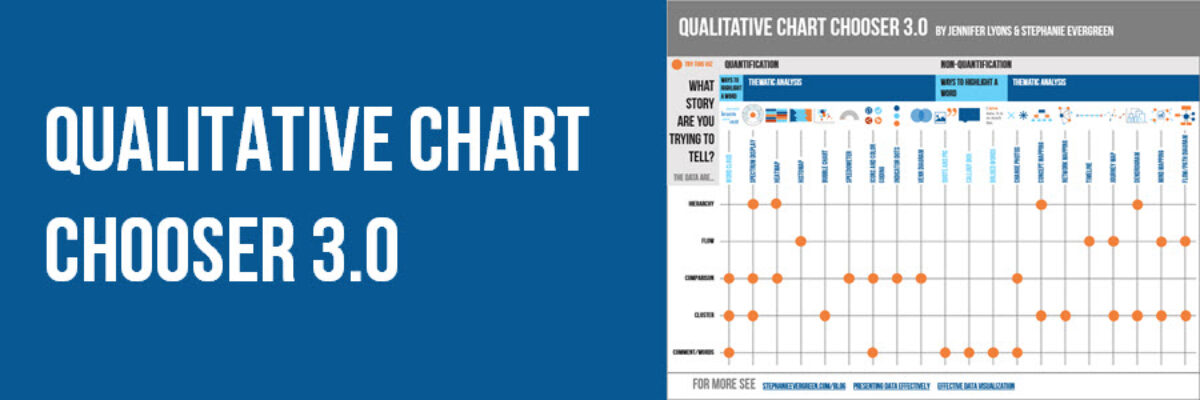
That’s why we are proud to release the Qualitative Chart Chooser. I’ll send the very most updated version of it to your inbox.
When we designed this qualitative chart chooser, it was important for us to incorporate (1) the overall nature of the data, which drives the kind of story you can tell, (2) account for whether, in your analysis, you want to quantify the qualitative data or keep it purely qualitative, and (3) whether you want to highlight a word/phrase or display some kind of thematic analysis.
Our goal is to make this chart chooser useful for all, whether you are a die-heart qualitative person or a quantitative person who periodically asks open-ended questions.
All other visual techniques we teach at Evergreen Data still apply to all these qualitative visuals. Let’s take something like a timeline (one of my favorite qualitative visuals).

Here is a nicely designed timeline (done all in PowerPoint). It visualizes different stages of an project overtime. No matter what way you slice it, this is slightly overwhelming. Remember your data viz secret weapon, whenever a visual gets overwhelming, break it up into small multiples. This is one of the most useful techniques to apply to qualitative visuals.
So when you include a project timeline like this in a scope of work, present it in whole form first. Then as you talk through each part of the project, show just a small portion in the margin. I also threaded color coding into the different sections of the scope of work.

We hope this qualitative chart chooser will make it easier for you to explore effective qualitative visual options. If there’s something on here that you haven’t heard of before (journey mapping, anyone?) we will tell you all about it. You can get started with our growing collection of qualitative visuals.
This chart chooser is in Effective Data Visualization, where Chapter 8 includes the largest compendium of qualitative chart choices available.
