Folks, I’ve been discussing dashboards forever. I’ve consulted with dozens and dozens of clients on dashboards. And through all of that experience, I’ve discovered that dashboards kind of suck.
Don’t get me wrong, I understand the need for a succinct complication of performance on key indicators. It sure beats a 200 page slide deck. But in the race away from the lengthy tomes of the past, I think the pendulum swung too far. These days, the dashboard trend is to try to cram everything important onto a single page. I’ve done it for clients! Here’s one:

I have taken many many clients to this place. And they generally feel good about the design. And then sometimes I’ll get the quietly concerned email from my fellow research nerds: Um, Stephanie? This looks elegant but we had major data collection issues in Q3 and that’s not obvious in the dashboard and I’m concerned that if the Board sees this they aren’t going understand the caveats.
Friends, these are legitimate concerns.
People are primarily driven by their eyeballs (haha, you thought I was going to say another body part but it really is the eyeballs). People want to look at the graphs and, if the graphs are strong on design and readily understood, people are going to take actions based on the graphs.
And this is when the research team freaks out. What about the context? What about how the measurement on this metric changes three times? Yikes, please don’t make decisions off of this quite yet.
But the modern conceptualization of a dashboard leaves little room for those extremely important narrative points of interest. This is the downfall.
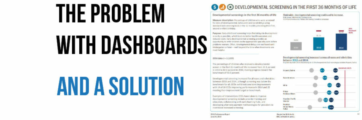
As opposed to a single-paged dashboard, let us loosen up to a dashboard report. Awhile ago I edited a journal article written by my friend Veronica Smith, where she outlined the difference. Where a dashboard is a single page of visualized metrics, a dashboard report is a multi-page document with one or two visualized metrics per page and healthy room for narrative. It’s the pendulum swinging back toward the middle, but not nearly so far as those 200 page text heavy doorstop reports. Here’s one page from a dashboard report I produced with some long term clients, the Oregon Health Authority:

You can see we are reporting 2 metrics here and they are accompanied by a text box that holds helpful explanation. It isn’t a burdensome amount to read; it doesn’t even fill up the left hand side of the page. But it gives the research team enough space to say their piece and feel comfortable sending the data off to the decision-makers.
If you are feeling a little too restricted by the current dashboard trend, try a dashboard report. You’ll emphasize the metrics with some high quality visualizations and add a tiny bit of narrative so you can sleep well at night.
