Over here I talked about how important it is that we gradually introduce components of complex graphics – one-at-a-time – so as not to overwhelm the visual field and working memory of our audience members. We don’t want to slam our content in their faces all at once. It let’s the audience read ahead and only half-listen. It can also be so much information at one time that audience members check out entirely.
Here’s how to use the same Slow Reveal technique on graphs, which I learned from the smart folks over at BrightCarbon.
First, insert your graph into PowerPoint.

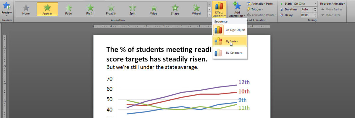
Then, with the graph actively selected, click in the Animation tab. Select a very low-distraction animation effect. Pretty much, this is limited to Appear. So select Appear. Because the graph is active, when you select appear, you’ll also get a button called Effect Options with a picture of a column graph on it. Click the arrow to see the menu options. In the case of a line graph, you’ll want to select By Series.

When you run the slide, it will begin with the title, axis, and gridlines. Just the skeleton of the graph.

As you click through the animation, each data line appears one at a time.
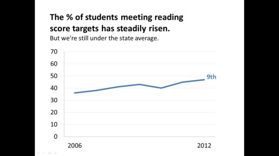
This way, you have the opportunity to walk your audience through each piece of the data, isolating their attention to that one point. It allows you to make more controlled comparisons, say, between 10th and 11th graders. It also allows you to equally emphasize each data line, as opposed to other methods I’ve shared where the lines are set in grayscale + an action color, which only emphasizes one data line.
Now generally I argue against animation because it acts funky or disappears in many webinar platforms – so use it cautiously and always test your slideshow on the computer you’ll be using for the live presentation.
Come join my online workshops. We’re talking about these same ideas as they relate to research & evaluation reports, slideshows, and graphs. In March you can even bring your own particular problem for small group discussion.
