Odds ratios are tricky. It isn’t actually all that hard to come up with some decent ways to visualize them. The tricky part is interpreting the results in a way that makes sense to average readers. How do you put the phrase “odds ratio” into a clear and easily interpreted sentence?
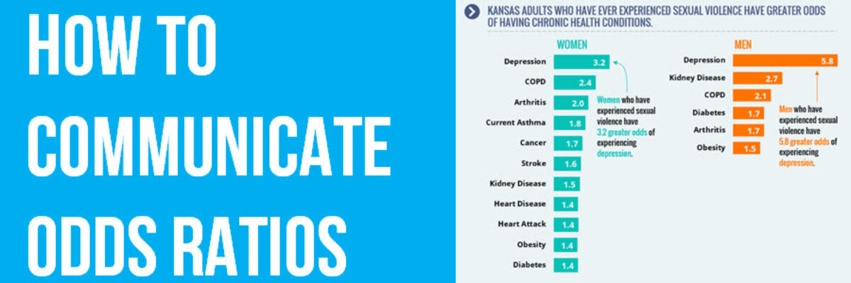
The Kansas Department of Health and Environment partnered with me to solve just such a problem. They had important data on the odds that people with histories of sexual violence will also have other health conditions. We went back and forth in our discussions about how to frame the results of their analysis. They wanted to say things like “5.8 greater odds,” which doesn’t have practical meaning to most of us. We had to work hard to balance out what is digestible to the public and most precise to the scientists responsible for data collection and analysis. We discussed (and I still ultimately favored) the option of framing it in terms of “likelihood,” as in “Men who have experienced sexual violence are 5.8 times more likely to feel depressed,” which I think is a more familiar concept the average readers. Ultimately, my clients felt the best balance was struck by using wording around “greater odds.”

So ultimately, we decided to visualize the odds ratios as a simple bar graph, which textboxes that interpret the top bar of data.
I get a handful of questions about how to visualize odds ratios every year and I usually tell those people what I just told you. Researchers Leon Gilman and Gerald Davis from University of Wisconsin – Milwaukee were behind one of those emails. They were trying to graph odds ratios related to race and disciplinary suspensions within a school district but said that staff in the school district found “odds ratio” to be too abstract and that they particularly had trouble interpreting odds ratios that were below 1. They ran with the idea of “likelihood” and produced this visual:

and they took it even further by completely rephrasing the discussion in terms of equality:

and, wow, is that a pretty powerful statement.
We help folks sort out these issues on their own projects, propelling them to data rockstar status, in our Academy and The Evergreen Data Certification Program.
