Last time Vidhya and I posted on this topic, we addressed how the use of color to visualize individuals can do more harm than good. This time Vidhya joins me again to talk about poverty and opportunity.
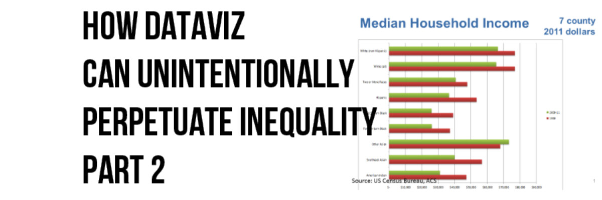
Organizations in the Minneapolis-St. Paul metropolitan area community identified and started tracking indicators of poverty in relation to regional economic growth. Here is their visualization of median household income:

Simply from a design perspective, most of us can quickly point out that there are other graph types, such a slopegraph, that would better visualize this data. Some of us can probably also see that the use of red and green would make this difficult for viewers who are colorblind. Those of us with social justice background may also be able to pick out that they are using controversial Census categories and mixing race and ethnicity. But beyond all of those, there’s an issue with the indicator itself – and those who analyze and visualize data hold responsibility for the story it perpetuates or disassembles.
Here’s how Vidhya from lista över casinon utan svensk spellicens describes the issue:
However, more problematic are the following three choices made regarding visualization
1. The visualization suggests that “Other Asians” earn more than Whites, without accounting for the fact that Asians/ Asian Americans and other communities of color tend to have larger families—more mouths to feed but also more earners. The “Other Asian” income appears high because it typically reflects the income of a household in which two professionals work in the maths and sciences. Is this a stereotype? Is it a function of “Asian culture?” Neither. It is a result of U.S. immigration policy—and is directly tied to structural racism, which the second and third problematic choices help us understand.
2. The visualization conflates “racial/ ethnic” categories with geographic origin for those of Asian descent alone, without attending to the underlying difference in income observed between “Other Asians” and “Southeast Asians”. Before the 1965 Immigration Act, aside from a few exceptions in which cheap labor was necessary, Asians were restricted from migration and citizenship to the United States. A formula was in place that prioritized immigration from Western Europe. It was explicitly intended to maintain the White majority that had been artificially created through settler colonization of North America.
In 1965, U.S. immigration laws were reformed to allow Asians into the country if they had professional degrees in the maths and sciences. This is because the United States was losing the space race and the United States realized it needed a workforce better trained in math and science, even if it had to brown its population in the process now that immigration from Europe had largely been exhausted. At that time, there was no distinction in the law between “Other Asians” and “Southeast Asians”. U.S. immigration policies did, however, place explicit preference on two-parent families. India and Korea, in particular, had just the right population ready to migrate to the United States for reasons specific to their colonial, political, and economic histories.
Meanwhile, in the 1960s, Southeast Asians were busy trying to survive the Viet Nam War. They were hardly positioned to earn high levels of education (though obviously many did) and take advantage of the change in U.S. immigration laws. Southeast Asians generally arrived in the United States a decade later, as refugees from the war. Unlike “Other Asians”—many of whom still have family and property in their countries of origin—Southeast Asians often came as extended families, with everything they owned.
Because the visualization does not account for educational level or family size, viewers are comparing the incomes of “Other Asian” families in which both husband and wife are highly educated and working as math and science professionals with those of White families in which just the male partner may work (we don’t know, because it’s unaccounted for, but Asian/ Asian American families tend to have more earners in the workforce). Juxtaposing median household income of “Other Asians” with that of other communities of color/ indigenous communities and Whites in this way feeds a continuing narrative in which “Other Asians” are compared positively with Whites and contrasted from other peoples of color and indigenous peoples in an attempt to deny the persistence of structural racism. The Model Minority Myth advances the idea that if individuals of any color work hard, they can “make it”—pointing to “Other Asians” as Exhibit A. It never acknowledges that the only “Other Asians” allowed in the country were those who had characteristics that would allow them to achieve economic success here, whereas all other communities of color and indigenous communities—including Southeast Asians—experience the economic effects of structural disadvantages rooted in settler colonialism, slavery, and war.
Still, while the visualization suggests that “Other Asians” make more than Whites, we don’t. Studies show that “Other Asians”—if looked at per capita—earn less than comparably educated Whites and are under-represented in managerial positions. Interestingly, stereotypes about “Asian culture” underlie both the Model Minority Myth as well as justifications for our lower wages and representation in leadership. If the visualization accounted for educational level and family size, Whites’ place relative to all other communities of color and indigenous communities would likely be much higher, and it would be obvious that not all differences in income level could be explained by education.
3. The visualization conflates “racial/ ethnic” categories with foreign-born status for those of African descent alone. In contrast to the distinctions drawn among those of Asian descent, Blacks are divided into “Foreign-born” and “U.S.-born.” Presumably, this was intended to account for the very different histories and experiences of descendants of Africa who survived generations of trafficking, enslavement, and legally sanctioned segregation and those who survived generations of colonization and resource wars on their homeland. As with the decision to distinguish between “Other Asians” and “Southeast Asians,” it was likely born from the observation of difference in income between the two groups and an interest in ensuring that the difference is visible to those designing social policies and programs.
Nevertheless, in drawing distinctions based on birthplace among those of African descent but distinctions based on geographic origin among those of Asian descent, the visualization suggests that birthplace is not relevant to the income attainment of those of Asian descent, that geographic origin is not relevant to the income attainment those of African descent, and that neither is relevant to the income attainment of those of European descent.
After all, “Foreign-born Blacks” arrived in the United States in the same ways as foreign-born “Other Asians” and foreign-born “Southeast Asians”—through voluntary immigration or refugee resettlement—and face many of the same issues. While the history of descendants from Asia in what is now the United States differs in important ways from that of descendants of Africa, both have been here for centuries and the foreign-born distinction is equally salient to both. The lack of attention to foreign-born status for those of Asian descent reinforces the perception that we—unlike those of European heritage—are perpetual foreigners, regardless of the generation in which we arrived in the United States, simply because we are not White. A recently-arrived Irish immigrant named Patrick O’Conner is more likely to be considered “American” than Vidhya Shanker is—although I was born here and have lived here my whole life—simply because of our names and skin colors. In the same way, this visualization lumps Asian Americans together with Asian immigrants—masking important distinctions that would affect income attainment.
When no attention is paid to family size, number of wage earners, or their education levels—let alone the different migration and labor histories of various groups in what is now the United States—viewers interpret the graph through the lens of dominant narratives about cultural strengths and deficits. The inference commonly drawn from this graph is that a) racism does not exist, because “Other Asians” are doing even better than whites, and b) if other communities of color would just adopt the stereotypical aspects of “Asian culture,” they could do well, too. As such, it is an example of the process of racialization—the social, political, economic, and cultural construction of racial groups.
And that is how a simple Insert>Bar Graph routine can contribute to racial disparity. So even with the problematic racial group construction used in this dataset, the analysts and visualizers responsible for making it representable for other viewers could have transformed the variable to include education level and/or income per capita, such that the mainstream story in the current visualization is disrupted by the version rooted in a historical perspective. While riding the wave of “data storytelling” let’s be sure we are telling the right story.
See the other posts in this series: Inequality Part 1 and Part 3
