Annual reports are where non-profits and foundations pull out their designer big guns. This is where they show off their muscles, like studs on the beach. The annual report is the place where an organization oils its accomplishments til they shine. The annual report is so important, most organizations still put in the cash to publish it in hard copy. Graphic designers load the report with beautiful pictures of success stories. But the data visualization sucks. Every time. And by “sucks” I mean it’s nonexistent.
Take, for example, my past client Global Communities. Gorgeous report. Dozens of pages of their work around the world with big, compelling pictures. Then you turn to the last page, The Financials. And it is the exact opposite of every other page in the report.
Why not visualize this? (Well, I suspect the short answer is because most graphic designers are not trained to handle data.) Here’s a first draft:
One of these is going to grab a lot more eyeballs, don’t you think? Tables do not engage because they are simultaneously really boring and really overwhelming – it’s too much information for a brain to process and make interpretations. But visualization digests the information and pulls out key points, like the fact that net assets are on the rise and administrative costs comprise 10.15% of expenses.
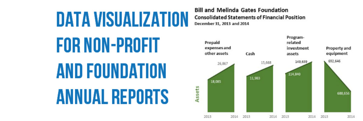
Some non-profits and foundations throw in even more data, comparing each line item to the year before. Here’s one from The Bill and Melinda Gates Foundation, developed by these guys who do the same for many large foundations.
Sure, a super accounting nerd will be fine with this display. But the point of producing an annual report is to speak to the public, which includes a lot more folks than accounting nerds. So how about a display more like this:
Now it’s much easier to see at a glance where Gates increased and decreased. One makes me stop and look and the other makes me think they are trying to bore me so much that I don’t notice how performance is actually changing.
Beyond being way more accessible to the public – your potential donor base! – a visualized financials page also goes in your board book. Think of how your board of directors will kiss your face when you show them a financials page that makes them drool just as much as the glossy photo case study pages. The nicest stud on the beach.


