Here is what a normal bullet chart looks like:

There are usually areas of performance in the background (acceptable/unacceptable, in this case), a target line, and an actual bar the represents your real value. Bullet charts kick ass for showing part-to-whole relationships for single data points, especially in long lists of metrics, like dashboards.
Sure, there is a bullet chart tutorial here, but I found it pretty complicated. And one here that’s fairly straightforward but, as an Excel graph, it takes some extra steps to resize or copy the graph with the data. There’s also a plug-in that makes bullet charts for you! So why write another blog post on it? Well, I was working with these methods until two things happened (1) I upgraded to Excel 2013 and the plug-in quit working and (2) my client needing something different – and my clients’ needs come first.
My client said, “Yo, we don’t need those gray shades in the background. These metrics don’t have performance levels. You either meet the target or you don’t [Ed Note: Sound familiar??] And furthermore, we don’t need a target line. The target should be the end of the graph, so that when the actual bar hits the end of the graph, we know we have met our target.”
And you know what? That way of visualizing the bullet chart made So. Much. Sense. At least for me, in this case and several others I’ve worked with since then.
And BONUS: this method uses in-line graphing with Excel, so the graphs don’t move out of alignment or require extensive size and positioning, like the others I mentioned above. We’re using conditional formatting to make these, peeps (and it works in Excel 2010, too!).
Here’s how:
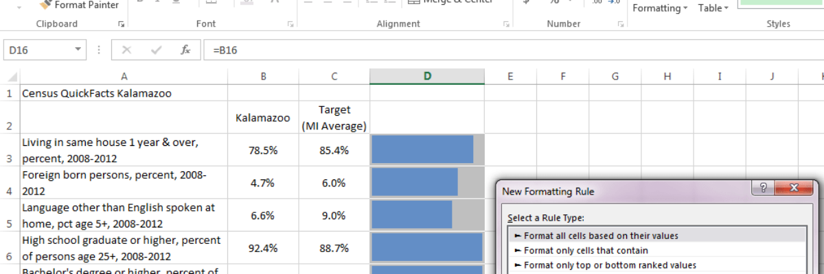
1. Copy your actual values into a column to the right of your metrics. Here we are graphing Kalamazoo’s Census facts, in comparison to Michigan’s average, which will serve as our target in this case. So I copied Kalamazoo’s column of data and pasted it again on the right. (I eventually filled these cells with a medium gray color too.) This is where the bullet charts will go.

2. Put your cursor in the first cell where you want the bullet chart. So here, that’ll be D3. Then click on the Conditional Formatting button in the ribbon at the top and pick New Rule. It’ll open up this dialogue box.
 By default, the highlighted drop down menu in the middle will say 2-color scale, so click the arrow and select Data Bar.
3. Adjust the settings in the dialogue box.
 Let’s walk through this bit-by-bit.
Check the box that says Show Bar Only, which will replace your copied data with just the viz.
Where it says Minimum, you’ll usually want to change the type from Automatic to Number. The Value box will populate with a 0. Generally, leave that be.
Where it says Maximum, you’ll want to point Excel to your target value, since that’s the way we are conceptualizing the bullet graph here. To do so, change the type from Automatic to Formula. In the Value box, type in the cell that contains your target value. Note that you need to have an equals sign (=) at the front and dollar signs before the letter and number ($).
Where it says Bar Appearance, you can change the fill color to match your brand. By default there will be no border but I actually gave it a gray border, which matches my cell background color, so the bar ended up looking a little skinnier.
Finally, under Bar Direction, select Left-to-Right. And click OK.
BOOM! Bullet graph! It’s embedded in the cell, so it won’t jump around on the screen like regular graphs can. It’ll copy into new spreadsheets with ease. And it’s pretty freaking easy to set up, compared to some of the other methods I’ve seen.
Optional 4. Handle negative actual values. I made up this data about Crime Rate at the bottom, but let’s pretend the rate since 2008 has decreased in Kzoo. In this situation, adjust the Minimum for the bullet graph by selecting Lowest Value.
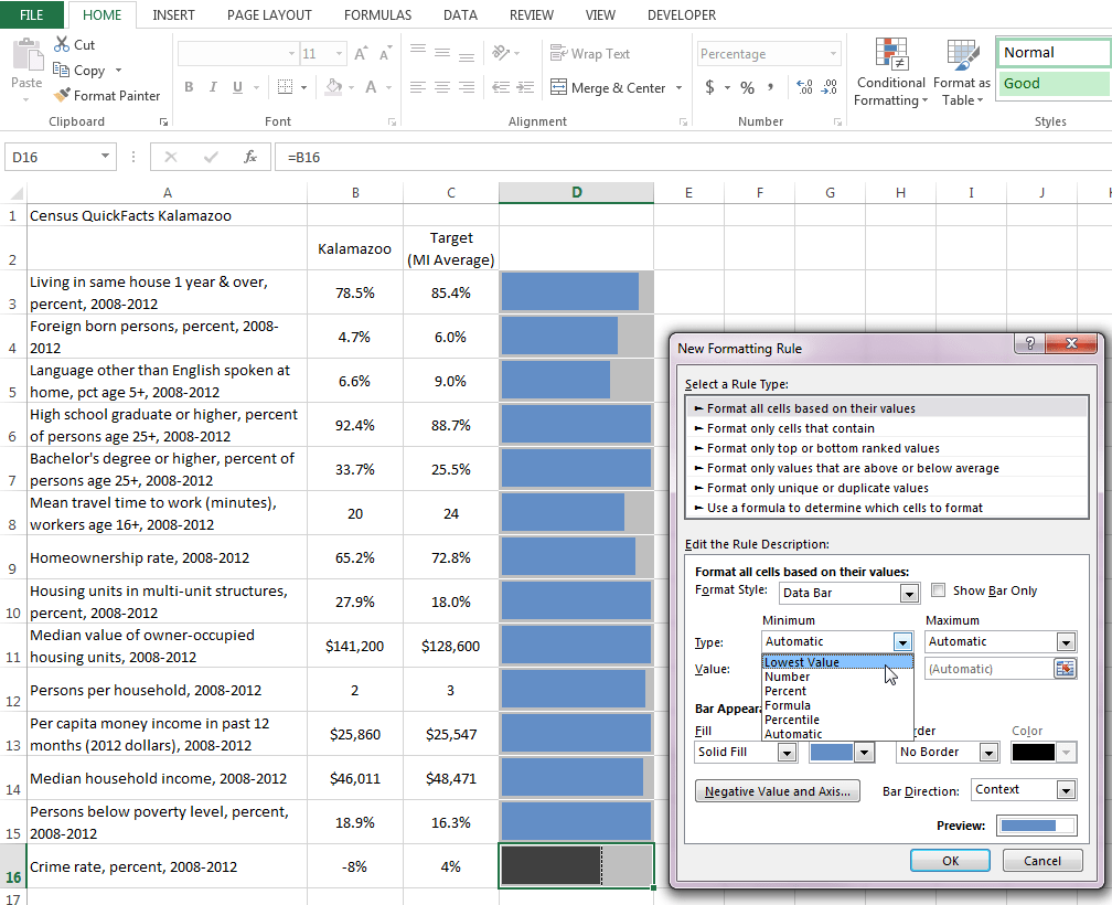
Then click on this gray button at the bottom of the dialogue box that says Negative Value and Axis. It’ll bring up a new dialogue box that looks like this:
 Here is where you can change the color of the bars when they are negative (red is default but it was to bright for my branded color scheme so I chose a dark gray). Note it will make an axis line appear, too, which better visualizes that the value is negative.
From here, we can order from greatest to least (without having to reshuffle lots of graphs!), add more data and maybe other in-cell indicators like sparklines and icons, and make it ten thousand times easier for our viewers to get a sense of performance at a glance.
THE MAJOR CON, IN CASE YOU HADN’T NOTICED: when the actual value exceeds the target, we’d expect to see a blue bar that goes past the gray background but Excel has these stupid in-cell margins, so there’s always a tiny sliver of gray that shows up, such that it could look like the actual values haven’t met the target yet even when they have. You’ll see this in rows 6 and 10, as examples. That makes this visualization method a little crude but again, it might be the best solution for your client’s circumstances.
Now, this post accidentally published last week and in the 45 minutes it was available for viewing, my friend Jon Schwabish jumped on it, saying these can’t be called bullet charts. He pointed out that Stephen Few, inventor of bullet charts, said they must have shaded areas of performance in the background. Well, I say maybe the definition of a fairly new method of visualizing should be broadened. Or maybe they don’t need to be called bullet charts at all. That’s okay with me too. My point, no matter what we call it, is to visualize data so it is more useful.
I’m talking a lot about dataviz these days. See if I’m coming into your orbit in my Upcoming Events and make sure we high five in-person!

You can find a lot more step-by-step instruction on how to make awesome visuals in my Evergreen Data Visualization Academy. Video tutorials, worksheets, templates, fun, and community. Excel, Tableau, and R. Come join us.
