I just finished a round of reviews for a major federal grant program and was, like every year, inspired to share guidance on how to design in such a restrictive environment.
Issue: Federal grant programs tend to specify the page margins, typeface, and font size to make the amount of content one can squeeze in to the proposal fairly equal for all. Those restrictions make my usual suggestions about bringing attention to key information fairly moot. What can you do?
Solutions: Your emphasis options now consist of all caps, italics, underlining, and bolding. DO NOT EVER USE ALL FOUR AT THE SAME TIME. Cause it’s really freakin annoying to read, isn’t it? Besides, you’ll be better off reserving one form of emphasis for your section headings. And you really should put one form of emphasis on your section headings because we reviewers have to navigate around your proposal really quickly when we are debating points on our panel phone calls. So pick one – like underlining – and apply it to your headings. That leaves three others at your disposal. People tend to think all caps reads like someone is shouting. I’m on the fence about then when it isn’t in an email context (cause who’s shouting in their proposal?). Italics, though, are hard to read and don’t typically provide enough emphasis. So bold. Bold it up, peeps. But selectively. Here’s an example of what I commonly saw in the proposals I reviewed (content totally fake, of course):
Kinda reads like you’ve had too much coffee, dudes. What’s really important in there has been completely diluted. Try for ultimate restraint and just bold the truly key words, like this:
Of course, it depends on what you find to be key – maybe it’s the groups of professionals you will work with (as in my case here) or maybe it’s the specific activities you’ll do with them – in that situation, bold the activities.
Issue: In most cases, potential grantees develop and submit their proposals in color. Makes sense. Program officers review the files in color. But these days panel reviewers are still shipped hard copies – printed in black and white. Uh oh.
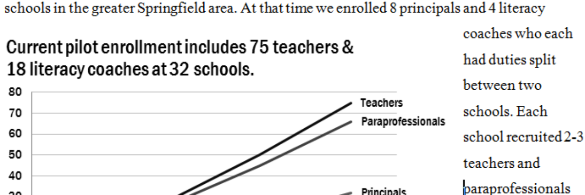
Solution: You may have noticed that I left color out of the solution options I presented earlier. That’s because it doesn’t hold up well. I saw some proposals where the authors put headings in a shade of gray – which was almost entirely disintegrated by the time I read it and make proposal navigation and assessment a bit more strained. This is not the situation you want to put your reviewers in. Graphs, also, fell victim to the dissemination route used in this review. I saw stuff like this, which was originally a pretty thoughtful way to orient the reader to the graph, but was useless in the end:
A better alternative is to plan for reading in a black and white environment. Use direct labeling and black or shades of darker gray to distinguish data points when needed:
It still isn’t a graphic designer’s dream, but it retains your data and that’s the point.
I know you are usually still typing your proposal moments before the deadline, but it pays off to print and check a few key pages to see how they’ll retain their information by changing your printer settings to black and white.
You can also work with colorbrewer2.org to identify a color scheme that will work by checking the box for photocopy-able.
Or, if working with graphs inside Excel, switch from the default rainbow color scheme to the default grayscale color theme (click Chart Tools>Design and then look in the Chart Styles family).
Know ahead of time that your reviewers will likely only see your proposal in black and white and design it within those constraints so we can see your ideas clearly. Thank me when you are accepted!
In other totally awesome news, my book was released on October 1! Sweet! AND I just added new dates for public webinars about designing great reports, slides, and graphs. Join me!


