Sometimes, whether we know it or not, the choices we make when we visualize data can reinforce and even perpetuate racial disparity and it’s time that we talk about it. The lull of the computer monitor and the belief we are just working with numbers can make us lose sight of the fact that there are people behind this data who have given of themselves, sometimes unwillingly, and that we have a responsibility to them when we visualize.
There’s a lot to say on this topic (maybe because it hasn’t been discussed out in the open very much). But I’m going to start here with an example from my colleague, Vidhya Shanker (she’s Director of Research, Innovation & Program Evaluation at Catholic Charities of St. Paul and Minneapolis), and share other examples in future blog posts.

The Case of the Bleeding Infestations

Maps seem to be especially prone to misrepresenting people in disadvantaged situations, particularly as we get ever closer to being able to pinpoint individuals’ locations geographically. Vidhya shared with me a map of concentrated poverty in Minnesota (a factor extremely comingled with being a person of color), where individual participants were marked by red dots. When presented to the actual participants living in these areas, they were not stoked. Instead, they felt like they were perceived as a threat, and the little pixels made them look almost like an infestation on an otherwise subtly colored map.

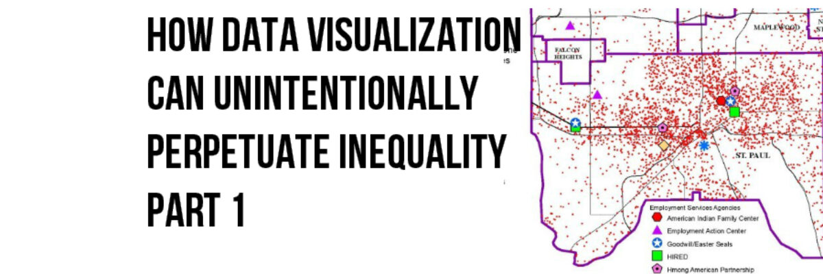
This is an approximation of that map (the original having too much embarrassing identifiable information on it) created by Mark Herzfeld, Senior Program Evaluator at Ramsey County and former colleague of Vidhya.

RamseyCensusBefore

Mark redesigned the infestation map in two ways so it was less visually insulting.

RamseyCensusAfter1RamseyCensusAfter2

Mark’s second redesign, where individuals aren’t mapped but rather the poverty rates are identified at the census tract level, may be the best solution because it aggregates the issue rather than identifying individuals. It also doesn’t use angry red, which Mark found on this other map of the area, and which he said looks “like gaping wounds sucking all the money out of public coffers.”


MetMapWounds

The original designers of these maps likely didn’t intend to offend anyone (well, let’s just assume that’s the case). Let this be a learning opportunity for the rest of us to be ever mindful of our choices in colors and visuals so that we can maintain respect for the individuals that provide us with their personal data.

See the other posts in this series: Inequality Part 2 and Part 3

Learn something new?

Share this helpful info with a friend who needs an extra perk today or post it to your social where your third cousin can benefit, too.