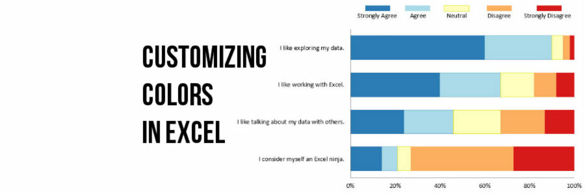
Few things scream “I didn’t try very hard” more than using the Excel default color schemes. Good news is that changing them up isn’t really very hard at all.
First, decide what other colors you would like. Maybe pick something from your organizational brand. I used ColorBrewer to come up with the color scheme here. I chose a diverging color scheme, where darker colors are on the ends and a neutral color is in the middle – because that fits my data, a 5-point Likert scale. Whatever color scheme you choose, make sure you copy down the RGB color codes that make up each color. (At ColorBrewer, you probably have to switch it away from HEX to RGB. At your office, there’s someone, I promise, who knows your RGB color codes, so just ask around.)
RGB stands for Red Green Blue and the 3 numbers you get there are the precise mix of red and green and blue needed to make the specific color you are staring at. Every color has a 3 number RGB color code. Write them down. Do you have your color codes?
Then you create your data visualization as usual. I chose a simple 100% stacked bar here (though there are other options).
Now I’ll click on the teal bars that represent Strongly Disagree so they are all activated. Then I right-click and in that drop down menu, click Format Data Series.
In Excel 2013, the dialogue box that pops up looks like this. I want the paint bucket icon. In 2010, click on Fill.
In the color menu I see there, I want to switch it away from Automatic to Solid. Then we need to customize that solid color so click on the arrow by the word Color and select More Colors.
It’ll open up a new dialogue box. Make sure you are in the Custom tab and WHAM. That’s where you type in your RGB. I typed in the dark red color I found in a diverging scheme at ColorBrewer. Dark red because, in this culture, we tend to associate reds with warning and danger. I’ll use blues, which we see as more positive, on the agree side of this Likert data.
Click ok and your stacked bar is one step away from looking default. Repeat this process for each of the segments in the stacked bar graph and you end up here:
Why do we go through this process? So that (1) you don’t look like a lazy schmuck, (2) people are better able to mentally group your Likert scale responses and interpret your data, and (3) you communicate more effectively. For about 10 minutes’ worth of work, those are some mighty amazing benefits.
You can find a lot more step-by-step instruction on how to make awesome visuals in my Evergreen Data Visualization Academy. Video tutorials, worksheets, templates, fun, and community. Excel, Tableau, and R. Come join us.


