We never hide data, we just don’t blast it at our audience as soon as they sit down. Here are a few ways you can answer expected follow up questions using Details on Demand.
Details on Demand
Read More
We never hide data, we just don’t blast it at our audience as soon as they sit down. Here are a few ways you can answer expected follow up questions using Details on Demand.
Tameeka emailed me this: “I’ve been a researcher for 10+ years but my passion and strength really is data viz. I’m trying to figure out how/where I can do that more than other research stuff. Should I start my own data viz business? Any chance you’d be down for like…
Hiring consultants to conduct studies can be an excellent means of turning problems into gold, your problems into their gold.– Martin Marietta Cheeky, Martin. But there’s some truth to that – consultants are expensive. In 99.98% of my consulting projects, my clients get so much value that…
A google image search of “data scorecard” turns up these results: Full, just FULL, of stoplight color schemes. Friends don’t let friends use stoplight color schemes. This is the tiny hill I am willing to die on. So Friend, let’s talk about why this has got…
Star Wars or Star Trek? I totally wasn’t expecting this MD to pitch me that question on live TV. Good thing I have a teenage son who has spent years preparing me for the right answer. The docs on the Medical News Network brought me on to talk…
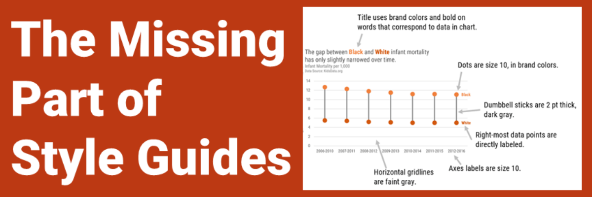
Half of the people in my data visualization workshops don’t even realize there’s a style guide lurking around somewhere in their organization, but chances are the Communications department has been begging people to use the style guide all this time. One big reason more folks don’t adhere to the…
Once a season I’ll get an itch to overhaul some part of my house. It’s an old house, so it usually happens that in the process of fixing one problem, we identify another that will send me back to my local hardware store and double the length of the project.
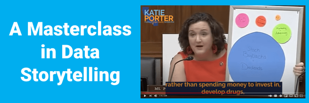
Everyone knows that when Katie Porter pulls out the whiteboard, someone is about to get schooled. This time, let us be the students. This video is a masterclass in data storytelling. And not just because she uses a chart. Let’s breakdown what you can learn from watching an expert make…
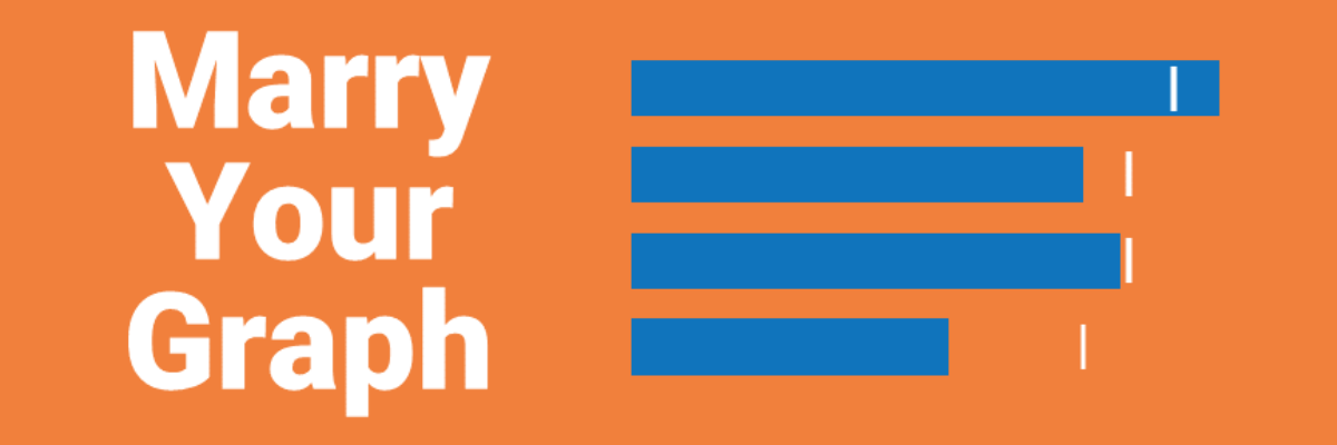
Here’s the thing: Your graph isn’t ever just going to chill out in your Excel file or Tableau worksheet. It’s going to live a life elsewhere, like in a dashboard, a slide, or a webpage. So when we make our graphs, we have to think about their future home environment.
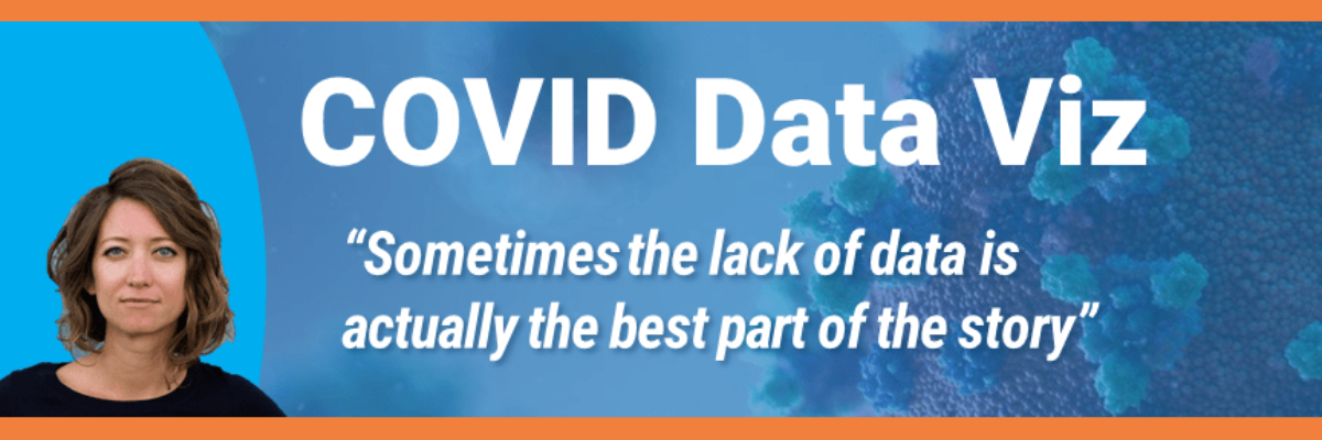
The morning that I’m writing this blog post, the US has just asked for a pause on the use of the Johnson & Johnson COVID vaccine because 6 women have experienced blood clots. That’s 6 cases out of the 6.8 million J & J vaccines administered, or 0.0000882%. This is…