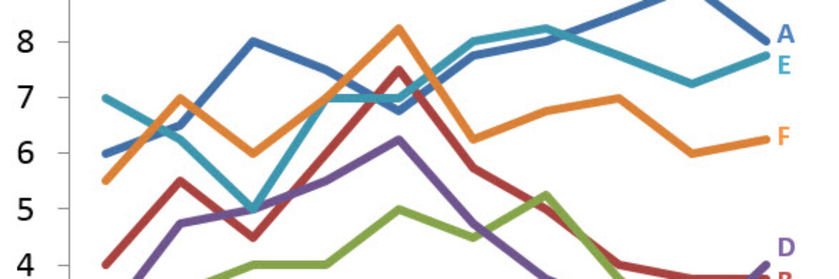
It’s time to ditch the legend. You know – the legend, the key, the thing to the right of the graph that tells the reader what each piece of your graph means. We don’t need it. Legends are actually hard for many people to work with because they put a…
Dataviz
Visualizing Likert-type Data: Try Aggregated Stacked Bars
Man, do researchers love Likert-type data! You know what I mean – the kind of survey response options that range from Strongly Agree to Strongly Disagree (or vice versa, depending on your allegiances). Probably the most common way of visualizing that data is via a stacked bar chart, just like…
When It’s OK to NOT Start Your Axis at Zero
UPDATE: This post was written in 2014 and my thinking has evolved since then. Here’s the newest post on how to handle all of your axes. You can also join us at the Evergreen Data Visualization Academy where we banter back and forth about these ideas and apply…
Declutter Dataviz with Small Multiples
Are you making graphs that look like this crap? I won’t make you raise your hand. But let’s just agree not to do this, yeah? It’s SUPER hard to compare the tops of a bunch of bars. Two side by side bars per region ain’t so bad but beyond…
The Easiest Way to Make Bullet Charts in Excel
There are lots of ways to make bullet charts, some easier than others, some better suited for specific visualization contexts. Hell, there are plug-ins you can purchase that make it a snap. Except when my plug-in broke and I had to remake about a…
Guest Post – Charting Confidence Intervals
Hi there! I’m Angie Ficek and I’m a program evaluator at a small evaluation consulting firm called Professional Data Analysts, Inc. (PDA) in Minneapolis, MN. In a previous post, Stephanie wrote about adding standard deviations to a dataviz. I responded to her post with an example of…
Adding a Benchmark Line to a Graph
This simple line packs so much power. Adding a benchmark line to a graph gives loads of context for the viewer. Here’s how to make one right inside Excel. It’s so easy you might pass out. My data table looks like this: I have my data and I have the benchmark…
How to Make Horizontal Dumbbell Dot Plots in Excel
In case it wasn’t clear, I freakin love dot plots. They are amazingly easy to read, beautifully simple in their display. I was making these babies for some clients a little while ago, before and after dots for about 25 variables in one graph.
Labels are Used Sparingly
This post is about how to avoid inducing claustrophobia in your data visualizations. Too much text on a graph clutters it up, making readers feel suffocated. So let’s address the checklist item Labels are used sparingly. Sometimes, too much text isn’t the issue. Take…
How to Rock the Text in your Data Visualization
Very recently, Ann Emery and I released the Data Visualization Checklist. It’s thorough and its going to help your data visualization kick some serious ass. In these subsequent posts on each of our blogs, Ann and I will illustrate some of the checklist items to…