Of course you can make data visualization that’s accessible to people with various disabilities. Take these 10 do-able actions to start.
10 Ways to Make Your Graphs More Accessible
Read More
Of course you can make data visualization that’s accessible to people with various disabilities. Take these 10 do-able actions to start.
The Data Visualization Checklist outlines what to do with each tiny part of your graph so it tells your story.
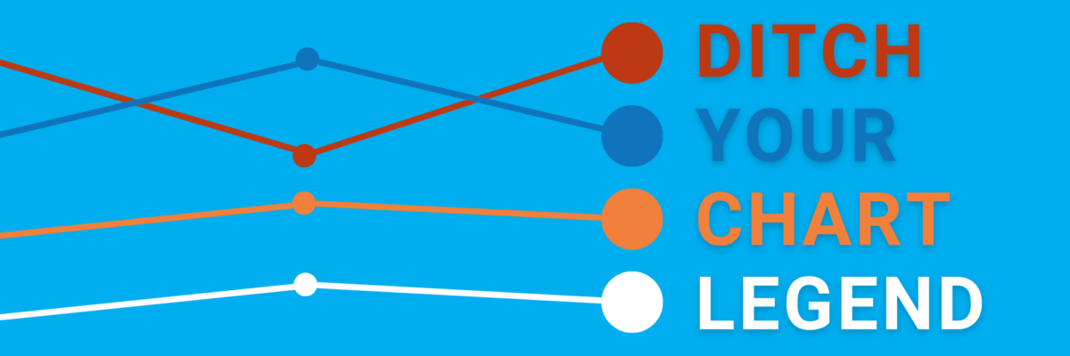
When we make our audiences seek-and-find to match the legends & the content, we hurt cognition. Brains want this 🤞🏼, not this ✌🏼.
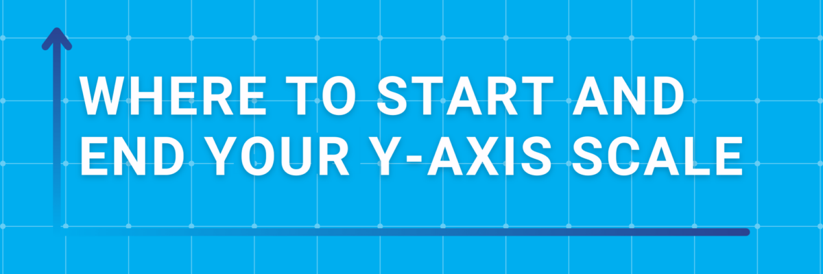
The Y-Axis Debate is one of the most hotly discussed among cool data nerds, like you and me and our friends. Going out for drinks with people like us is either a blast or a bore, depending on your nerd level. So let me clarify the parameters of the…
You see the constellation where your audience only sees a random smattering of stars. What makes sense to us (who have been so steeped in the data we’re dreaming about it) will not be readily obvious to an outside viewer (even if it’s someone who cares quite a lot about…
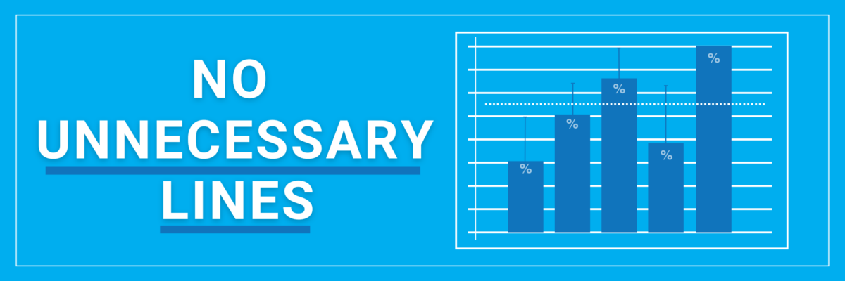
In sum, no unnecessary lines. Your job, with the help of the Data Viz Checklist, is to learn to distinguish between a necessary line and an unnecessary one.
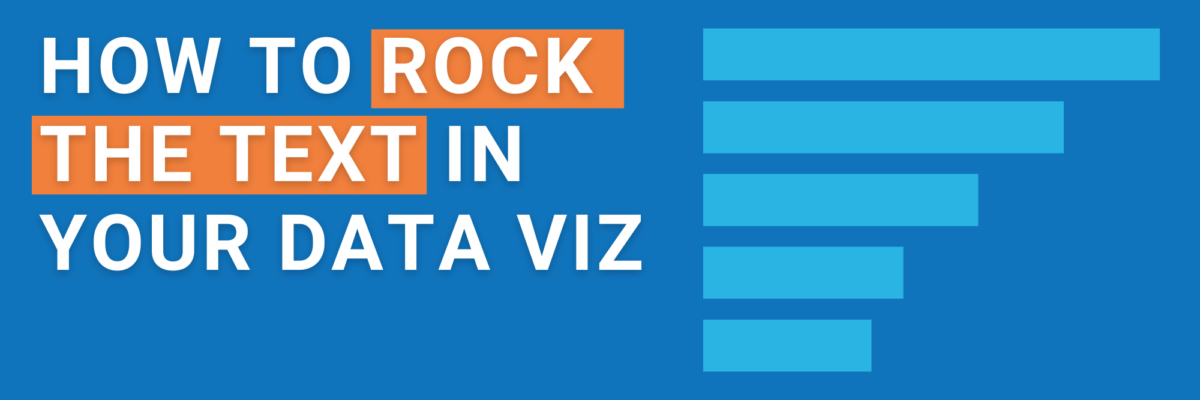
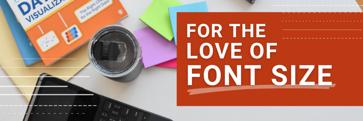
You only get a little bit of text in your graph. Here’s how to make sure you get the most mileage out of it.
The minimum font size to use in your graph depends on the graph’s final destination and how far it’ll be from your readers.
How many decimal places do you really need? The level of precision in your data visualization depends entirely on your audience.
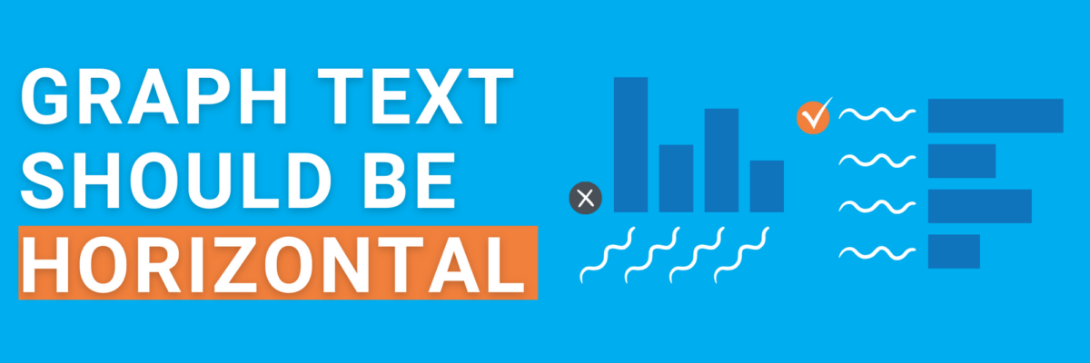
If your text wraps onto multiple lines, is diagonal, or cut off, your graph type needs to change so your text reads horizontal.