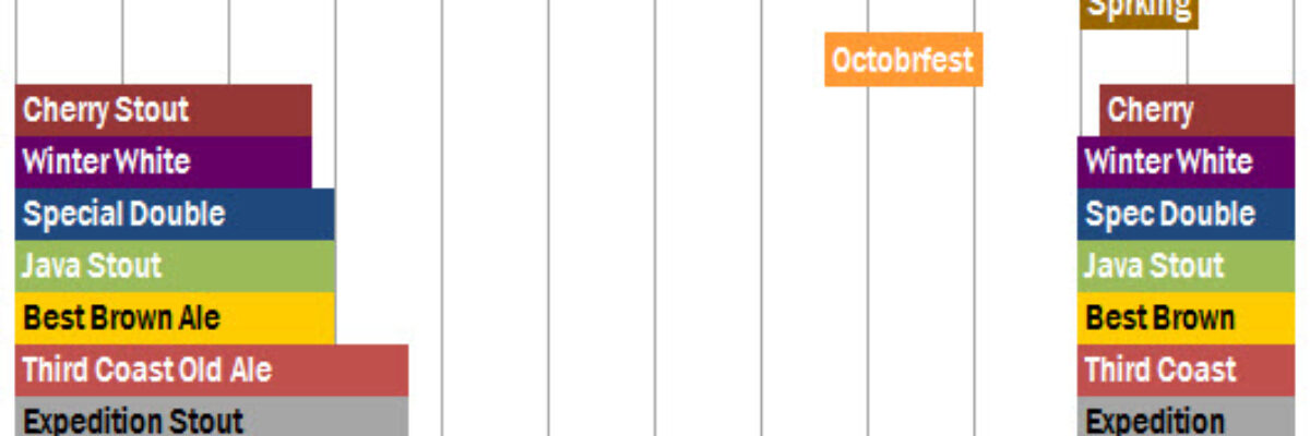
Time to tackle some of the more important parts of life. I saw this delivery schedule in a cooler at a DC Whole Foods. Bell’s Beer is from Kalamazoo and we take pretty big pride in our hometown beer. So we (I mean, I) get really geeked when Bell’s shows up during travels. But this delivery schedule? It’s not working for this data visualizationist (I just made that term up – how does it sound?).

I couldn’t put my finger on precisely what bothered me so much about it, so I took a snapshot and mulled it over for a few weeks. Here is the revised chart I settled on.

The revision still isn’t sitting right with me, but I’ll tell you what important changes I did make:
1. I reversed the order of the listings. Previously, the beers that are delivered year-round were closest to the headers listing the months. That meant that the ones that were the most narrowly distributed were furthest away from the month listings, making them the hardest to decipher. In the revised version, I also just put the month listings across the bottom of the chart, too. Why not?
2. The beers are in a very slightly different order, now depicted by the length of months they are on the market. Just adding a little more logic.
3. The labels over the bars make for less seek-and-find. Previously, the viewer would have to locate the desired beer label, trace the bar to the right, and then simultaneously locate the months across the top, traveling that information down the graph, to find where the paths crossed, just to determine if Favorite Beer was in stock. Too much. This way, we remove one element of difficulty in decoding the chart. Still, I’m unhappy with how I had to abbreviate the top two beers to make them fit in the label.
4. White background. The textured orange background (intended to be beer) was too busy and conflicted with the colors used to differentiate each bar. I’m not totally in love with my new color scheme, but it’s a step up.
If I had access to the beer label icons, I would have still placed them along the left side of the chart. That visual cue is important for the viewer to quickly identify the beer in question.
