You see the constellation where your audience only sees a random smattering of stars.
What makes sense to us (who have been so steeped in the data we’re dreaming about it) will not be readily obvious to an outside viewer (even if it’s someone who cares quite a lot about the results).
We can help our audience see the connections between our data points by assigning a color system to our graphs.
A Color For Each Category
Say we introduce this first graph on math test scores for Northern High School.

Whether it was intentional or not, we have now introduced a color-coding scheme for the data. 9th graders are dark blue, 10th graders are light blue, 11th graders are orange, and 12th graders are red.
So let’s be super intentional and maintain this color assignment in other charts.
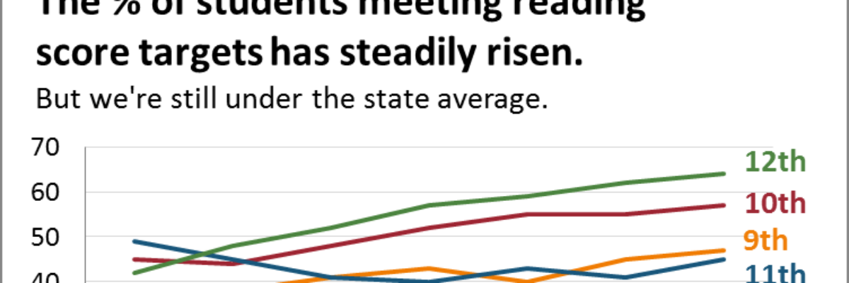
Because let’s say we have a 9th grade parent in our audience. They’ll look at the 9th grade = dark blue line and search out that same dark blue elsewhere, like in this chart on reading.

It would be confusing if we made 9th graders any other color but that dark blue.
So assign a color system and stick with it.
You can even reinforce the color scheme by making the data labels at the end of each line the matching color.
Take it even further: When you put grade-level data in tables, use the same colors on the column headers.
When you write about each grade level, the heading “Ninth Grade” should be in light blue.
Consistent use of the color system makes interpretation faster and engagement easier.
You with me so far?
I have an unfortunate point of consideration.
This shouldn’t prevent you from assigning a color system to each category, but it’s something to keep in mind: People have meanings they associate with colors. Read more on color psychology. There’s a lot to learn. But, in short, some people will see 12th grade in red and think that means 12th grade is bad.
To some extent, you can ignore that. You’re teaching people new color associations with your system.
On the other hand, take advantage of this.
A Color for Each Sentiment or Rank
If you know your audience generally associates red with negativity and blue with positivity, use that as the basis for your color system.

For example, with student performance, you’re often working with data that’s broken out into 4 performance ranks, from Not Met to Exceeded. Assign colors to each rank.
Same idea works if you’re primarily reporting survey data in a Likert-type scale, like Strongly Disagree to Strongly Agree.
This color system assignment will tap into your audience’s cultural color associations and make the visuals that much more readily understood.
Sorry to do this, but there’s a wrinkle in this plan, too.
If you assign colors to ranks, what would you do with that line graph from earlier?
You can’t try to make red mean both “Strongly Disagree” and “12th grade.” Don’t go mixing color systems. You only get one.
You likely don’t want 4 totally different colors on the line graph, in addition to the four colors in the diverging stacked bar. That’s probably too many colors for one data communication piece.
Maybe the line graph is in four shades of one color?
Maybe you convert it from four lines in one chart to small multiples?
You have choices (you can probably think of even more) – but no matter what, it’s a wrinkle to iron out.
Build a strong color coding system and repeat it without variation.
A color system will help your audience move faster, graph to graph, and make quicker connections between the data points spread out in different charts.
