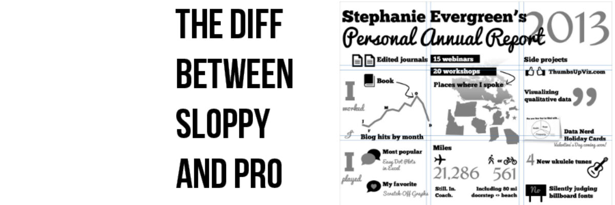
This is the hardest part of design to get right. It’s what differentiates sloppy, weak design from that which looks tight. It’s the use of a grid. Arrangement matters.
It’s the sort of thing that gets talked about in design workshops, but people tend to get so caught up by fonts and icons that the boring, structured stuff of arrangement falls by the wayside. Everyone starts singing “Let’s Get Visual, Visual!” like Olivia Newton-John and we start cranking out stuff like this:
 It’s definitely a nice step up from a written annual report but man oh man does it look like a mess. Like someone just vomited my workshop contents onto a canvas. The biggest contributor to that sense of gross madness is the lack of a grid. Things just aren’t organized. The & is not centered, “edited journals” is too close to “15 webinars”, “Blog hits by month” and “Side projects” aren’t aligned and dozens of other errors that make this a death by 1,000 cuts. It seems like little things, but it is the little things that make a difference.
This is the actual way I presented this same information back in 2013:
 It’s better, but it isn’t the best. Some things I did right: I regrouped the elements on the canvas so stuff that logically belonged together was hanging out in the same vicinity (for example, notice how the side projects are all in a column now). I was also using the Rule of Thirds to create three columns, so that I could align the text boxes and whatnot. See?
Only… I could have adhered to it better. Miles and Still. In. Coach. don’t quite line up. And some things (the D) are crossing the line. AND I didn’t adhere to the three rows very well at all.
Nothing is really lining up with those horizontal lines. Ick. (Side note: Isn’t it cool/scary how stuff we thought was pretty rad not so long ago now makes us shudder?)
What’s more, I shouldn’t have been using simple single lines. I should have been using double lines, to create a gutter.
 The gutter gives a bit more breathing space between each section of the grid. I made this gutter by inserting lines (you know, Insert>Shapes>Lines) on top of my slide. Then I nudged and arrowed and tweaked the pieces (and even deleted one or two things) so they better fit inside the grid. When I was finished, I deleted the grid lines.
 Feels a lot more organized, cleaner, and less claustrophobic. It is probably the most tedious part of design, all that nudging. But the payoff is looking like a pro. Watch for the small differences in this gif, where I go through all 3 versions of this annual report.
Fonts and icons are sexy and fun but arrangement makes the difference between sloppy and pro.
I teach about arrangement in my first book, Presenting Data Effectively, and in my workshops.


