Do you need to communicate your standard deviations to your audience? No, I mean, really DO YOU? Think hard about that because chances are your audience doesn’t give a crap. They want to know you calculated your standard deviations. They want to know you were meticulous in your number crunching. But most likely they do not want you to actually tell them the standard deviation. Tuck that ish in an appendix or something.
But in the rare circumstance where your audience really does want to see your standard deviations, here’s a pretty easy way to visualize them in your graph inside Excel. It represents the standard deviation via a gray band behind the mean scores, using a stacked area chart. Sounds complicated, I know, but it’s actually pretty simple and these are the step-by-step instructions. In this example, we are visualizing mean reading scores for schools across the state.
Step 1, we calculate means and standard deviations for each of the 5 years we are reporting on.

Step 2, add the standard deviation to the mean to calculate the upper end of the standard deviation range. And subtract the standard deviation from each mean to get the lower end of the standard deviation range.
Step 3, the difference between the upper range and the lower range is the full standard deviation range, so calculate that by subtracting the lower range from the upper range.
Step 4, graph. We want to create a stacked area chart, using this guy:

So highlight the values in the lower range and the full range, click the stacked area graph, and get this:

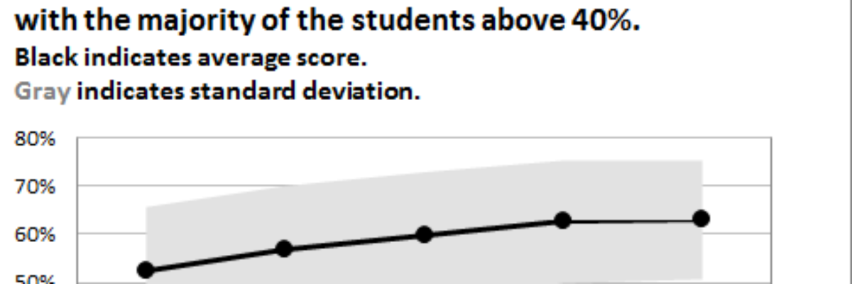
As my notes suggest, change the default colors of the stacked areas so that the lower range is no fill or white and the actual standard deviation range is gray. That’s your gray background, yo!
Step 5, add the mean values. First, right-click on the graph, click on Select Data, and add your mean values as a new series. It’ll look like this:

You don’t want it to look like that, but don’t freak out. Just keep going.
Step 6, click on that new area representing your means so that it is highlighted. Then change the chart type and select a line.

It’ll look like this:

Whew! That’s more like it.
Step 8, format! Add an explanatory title and a legend-like subtitle to convey what standard deviation actually means.And there you have it. But wield this with care, okay? Standard deviation, while important to us datanerds, can elicit deer-in-the-headlight stares from many audiences.

You can find a lot more step-by-step instruction on how to make awesome visuals in my Evergreen Data Visualization Academy. Video tutorials, worksheets, templates, fun, and community. Excel, Tableau, and R. Come join us.
