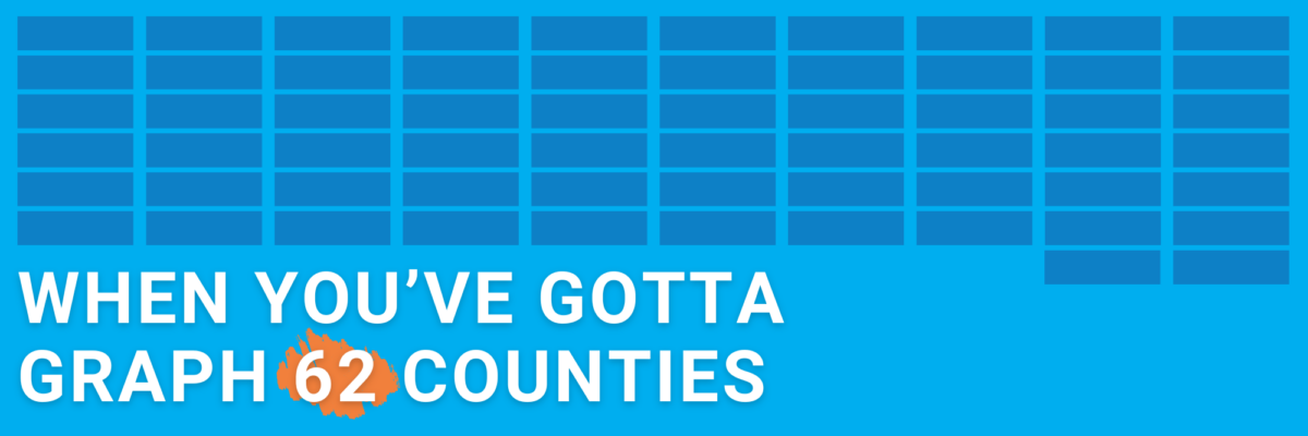
or countries or students or departments or… you just have a lot of categories to squeeze into your chart. How to proceed without creating a hot mess?
When You’ve Gotta Graph 62 Counties
Read More
or countries or students or departments or… you just have a lot of categories to squeeze into your chart. How to proceed without creating a hot mess?
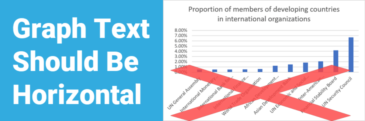
In languages based on the Latin alphabet, we read horizontally, from left to right. Reading on a diagonal produces cramped necks. Reading vertical text is just not going to happen. So, as much as possible, the text in our graphs should be horizontal. Let’s walk through a demo. I was…
Very recently, Ann Emery and I released the Data Visualization Checklist. It’s thorough and its going to help your data visualization kick some serious ass. In these subsequent posts on each of our blogs, Ann and I will illustrate some of the checklist items to…