Note from Stephanie: I asked Sheila to write this post because I still get tons of questions from readers about how to take the design I recommend for data visualization and apply it to survey design. I’m not a survey expert, but Sheila is!
Hi! I’m Sheila B. Robinson, a program evaluation nerd turned survey design geek. Along with my co-author, Kim Leonard, I’m writing a book on survey design with a focus on question design.
Today I’m sharing 6 formatting tips for surveys. With the increase in survey fatigue resulting in non-response, paying attention to the way we craft surveys these days is critical. However, with the growing popularity of online platforms such as SurveyMonkey, SurveyGizmo, and even Google Forms, we’ve shifted our focus away from the formatting necessary for surveys, often relying on default formatting instead. Many of us have moved on to hard coding survey layout and even others are still using paper surveys. So let’s remind ourselves how to format fabulously.
Don’t build a house on a shaky foundation. Start with high quality raw material: good questions, clear, concise directions, and an invitation that indicates the survey is relevant and interesting to potential respondents. Your survey must be compelling or you risk respondents tossing it aside in favor of better ways to spend their time. Design your paper survey with these factors in mind: visual appeal, ease of completion, and accuracy. A survey should visually reflect this message: Come on in! This will be fun! And don’t worry. It’ll be quick and easy to complete. Use these tips to send that message.
1. Choose plain, serif fonts for questions, and complementary sans serif fonts for titles and headings. Stephanie has taught the world about font personalities and effective font choices. Do yourself a favor: read Chapter 3 of Presenting Data Effectively.

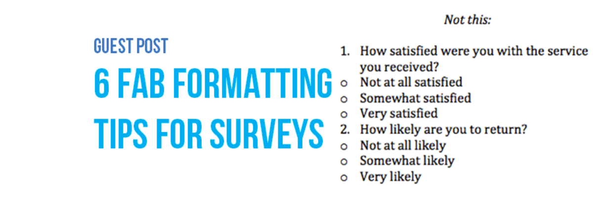
2. Question stems and response categories should be clear and separate. Use visual cues such as a slightly larger font for the stem, indent categories, and add space between questions to provide a visual hierarchy and increase the likelihood of a rushed respondent seeing and answering all questions.
Don’t like the bullets or want a different size or shape? It’s easy, and you can do it one of three ways:
Option 1: Adjust bullets Look at the button you use to create a bulleted list. See that arrow indicating a drop-down menu? Click it and you’ll find a wealth of options to easily change the shape and size of your bullet. In other types of applications (reports, slides, etc.) you want bullets equal to or smaller than the text, but here you want them to stand out, so make them larger than the text.

Option 2: Insert shapes, then align If you don’t want bullets, and find yourself using the insert shape tool to draw circles or rectangles, then you must use the align tool, or you’ll drive yourself crazy! Find it on your toolbar, or by right clicking your shapes (be sure to select more than one shape). Although more labor intensive, the advantage here is in being able to shade the shape or adjust the line weight.


Option 3: Insert a symbol This option isn’t too different from using bullets. Among the available symbols are open circles and squares. These work just like text characters, so no additional alignment necessary. Using symbols is best when response categories are in the left-right plane, as opposed to up and down.


3. Consistency is key! Pay attention to the order of response categories. In general, if using rating scales, category choices should read from the least desirable responses (on the left or top) to the most desirable responses (on the bottom or right). Rating scales with numbers should read from least to greatest.
4. Use icons or symbols in conjunction with text variations (bold, italics) to signal special circumstances such as skip logic (conditional branching). Use a box around headers, to signal a change in the nature of the questions.
5. Use a table to help with overall alignment. Then “hide” it by eliminating the borders.
6. If you are using color, use it judiciously and intentionally, paying attention to how your paper survey will photocopy and be accessible to those with various types of color-blindness. The purpose of using color is to signal change, or in places where you especially need a respondent’s attention. Read Chapter 4 of Presenting Data Effectively to learn more about using and choosing color.
Check out my blog posts on survey design and look for the book with SAGE Publications in 2017!
