Being accessible – meaning making our data visuals interpretable by people with various disabilities – comes up in every one of my workshops.
One of my workshop attendees relayed to me that her company had hired an accessibility consultant who swiftly concluded that, to be accessible, they couldn’t use any graphics.
Excuse me, what?
Of course you can use graphics. In fact, graphics actually make your work MORE accessible. If you design them right.
So here’s what I teach in my workshops.
10 ways to be more accessible.
1. Use full-sentence titles that tell the point.
Your chart title should be a complete sentence that communicates your main takeaway idea from the data. This guideline is so important, it’s the very first item on the Data Visualization Checklist. This is mission critical.

Use language that matches your audience. (This may be a time to use AI to help you plain language your words if you have trouble getting out of your deep well of knowledge.)
Most of the time when people think about accessibility, they’re imaging someone without vision, who is relying on a screen reader to speak aloud the contents on the screen. Full sentence titles are helpful for those folks and we’ll come back to this in a bit.
Consider other disabilities too. People with some cognitive impairments will be benefited by being told what’s up in the chart.
People with low data literacy levels will understand the point instead of feeling frustrated by the lack of clarity and just quitting on you.
Heck, full sentence titles assist me and I don’t fit into any of these categories. I just don’t want to have to guess at what you’re trying to tell me!
2. Use an accessible font.
I will always advocate for a condensed sans serif font in your data visualization. It strips out some unnecessary clutter and maximizes the real estate you can devote to the actual visual, because it takes up little space.
With that in mind, to ensure your font is accessible, the most important thing to watch for is character distinction. Be sure that a lower-case l is distinguishable from an upper-case I and the number 1, for example.
Ever been confused about whether the wifi password contains a number 0 or an upper-case O? Exactly.
As with every strategy I’m giving you in this blog post, this one will make life easier for your entire audience.
3. Ditch legends.
Legends are incredibly taxing to our working memory. All that bouncing back and forth to match up the line to its legend entry requires a good deal of mental gymnastics. Which means, these will be a challenge for people with some cognitive impairments.
A better option? Label your data directly.

This also reduces confusion for people with color-based vision disabilities. Those disconnected legends mean a reader is relying solely on color to interpret the graph. So colorblind folks are gonna struggle to simply understand which line represents each data series.
By labeling the data directly, we get everyone off the struggle bus.
4. Get thicc.
Make your bars taller. Make your lines thicker. Make your dots bigger.
Not so thick or big as to suggest imprecision. But big enough to be seen, especially for those with any vision impairments (which is a lot of people – if your text app is in large type, I’m talking about you).

This will especially be critical if your graph is going into a presentation, to be viewed in a large room. Those thin, skimpy lines in your line graph are gonna disappear.
5. Go big.
Increase the size of your visual. It’s the main thing people are gonna consume, for starters. Make it big so they can see it.

Often we’re trying to shrink our visuals to make space for our precious words but in the hierarchy of care, visuals come first.
This might mean you cut some words.
Or add length to your entire document. Don’t stress. If you have large, engaging visuals, people barely pay attention to length. The only time we start to think “how many more pages????” is when each page is a thick block of nothin but text.
6. Check colorblindness.
I’ve talked about this elsewhere, but it’s so important it’s worth repeating whenever I get the chance. You need to avoid using red and green in your charts.
This:

Looks like this to someone who is red/green colorblind:

Red/green colorblindness impacts roughly 10% of men with European ancestry and about 6% of Japanese men. Less prevalent in other demographics. Absolutely something to address in your data visualization.
When you use the Data Visualization Checklist, I’ll show you what your chart looks like to someone who is colorblind so you can be sure your visual will work.
7. Check color contrast.
Light-on-light and dark-on-dark are a problem for everyone – not just those with disabilities. Watch out for places where dark labels on a dark segment of the bar graph and light segments against a white background introduce legibility issues.

Try a color scheme that makes more sense for the data itself and settle in with the notion that the data labels can be different colors, colors that contrast better.
Check your choices by looking at your print preview settings in black and white or try a color contrast tester.
8. Be mindful of tooltips.
Folks with significant vision impairments are going to use tools like screen readers or other assistive devices to access our materials. You should really try a screen reader sometime. You’ll learn that you have to tab or arrow your way from graphic element to graphic element.
So how, exactly, are you gonna arrow to a tooltip?
Right now, until technology evolves further, you aren’t.
Personally, I only put information into tooltips that can be accessed through another method, like downloading a table of the data.
9. Use the built-in style settings.
Microsoft has a baked-in placeholders for things like your chart title and data labels. You should use these rather than go rogue and insert textboxes.
Screen readers work with Microsoft to pick up the fact that those particular words are designated as the title while those others are the data labels.
If you’re inserting your graphs as picture files, the built-in style settings won’t work. You’ll need to…
10. Add alt text to graphics.
I hesitated to add this strategy to this list because it’s data sonification, not specifically visualization.
You should add alt text when creating your graphs. To do this in Microsoft, right-click on the graph border and select Format Chart Area. Then look for this little option called Alt Text.
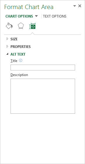
Here, you’ll want to give the image a name and a description. The description needs to be such that the person on the other end can comprehend the image fully. This is what will be read out loud by a screen reader software.
You go through this same process when uploading the graph as an image to a site like WordPress. Upon upload, it asks for the Title and Alt Text.
Plan to PDF your document? Alt text won’t carry over there. Want to add alt text to Tableau graphs? Got a full explanation in alt text that’s going to be amazingly hefty?
It can seem like this is going to get tricky, fast. But we’ve got the step-by-step directions and shortcuts in the Data Visualization Academy.
Compliance doesn’t have to be difficult. In fact, many aspects are just good design for all. When we implement these tools, we don’t just make our data visualizations more accessible to those with special needs. We benefit everyone.
